Manage App
UI/UX Design
Taking the most popular features from Manage and combining them with a new user-friendly interface designed to help technicians complete assigned tasks quickly and efficiently.
Taking the most popular features from Manage and combining them with a new user-friendly interface designed to help technicians complete assigned tasks quickly and efficiently.
As the UI/UX Designer on the mobile app team, my primary responsibilities included researching, white-boarding, designing, and prototyping implementation of new features for the manage mobile app designed to help service techs complete assigned tasks quickly and efficiently.
I was building new features upon new iterations of the mobile app from the ground up. This page will showcase the basic design process for the Manage Mobile App.
My Role:
User Research, Interaction, Visual design, Prototyping & Testing
Duration:
Oct 2019 - July 2020
Tools:
Jira, Sketch, Zeplin InVision
The app was built with from the grounds up with React and was shipped as a MVP product. Because of this, partners and users were frustrated that the app lacked the robust features from the original app. Lack of resources for the mobile team made it more difficult to ship out these features quickly.
The team and I continuously work in agile to take the most popular features and combining them with a new user-friendly interface designed to help service techs complete assigned tasks quickly and efficiently. We take in feedback on shipped features and constantly iterate to fine tune and improve the user experience.
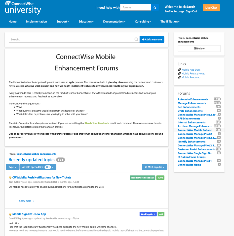
We had several sources to identify the painpoints that would determine the features to add to the minimum viable product of the app as well as features that were already implemented in the original app version. In addition to partner feedbacks and focus groups, we had enhancement forums, partner reviews, and feedback sumbmissions through the app itself.
The enhancment forums is an exclusive forum where users and partners who had access can share their suggestions and feedback to improve upon current features.
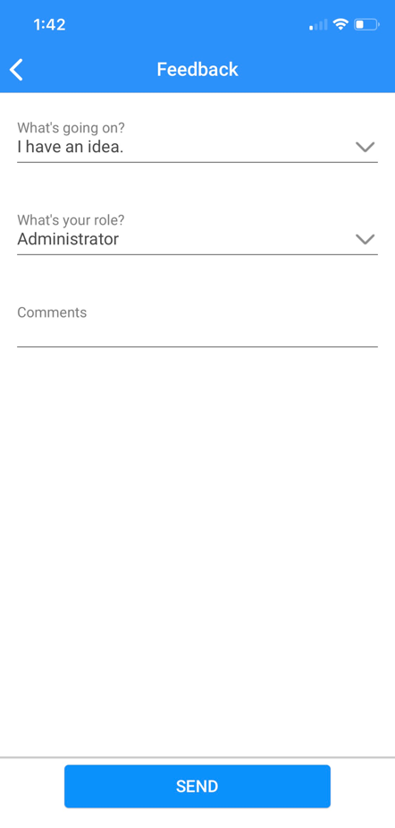
The app had a feedback screen where users can share their usability or functionality problems as well as suggestions to improve the UX experience.
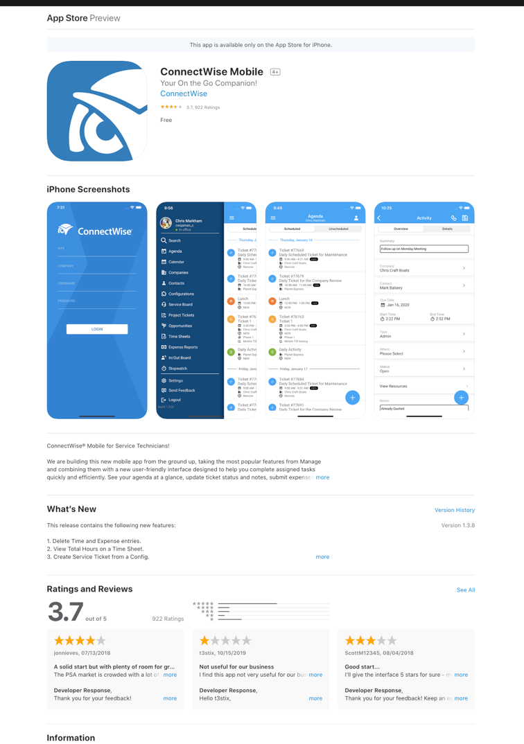
Going through the app reviews from the google and apple store helped identify and functionality pain points as well as useful feedback.
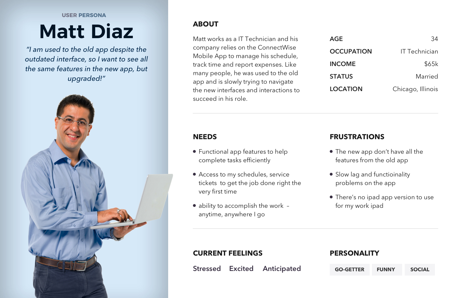
The target audience of the app are IT technicians who use the app in the field. I designed the app interfaces, interactions, and screens according to best practices and with this primary user in mind.
During our grooming meetings, we go over the road map discuss the technical aspects of the features, what can be designed and developed by deadline, and what needs to be backlogged.
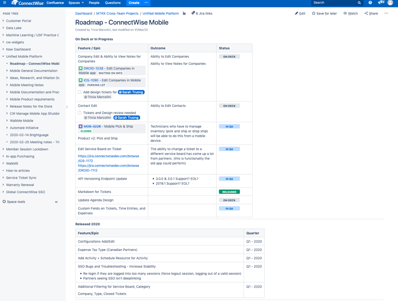
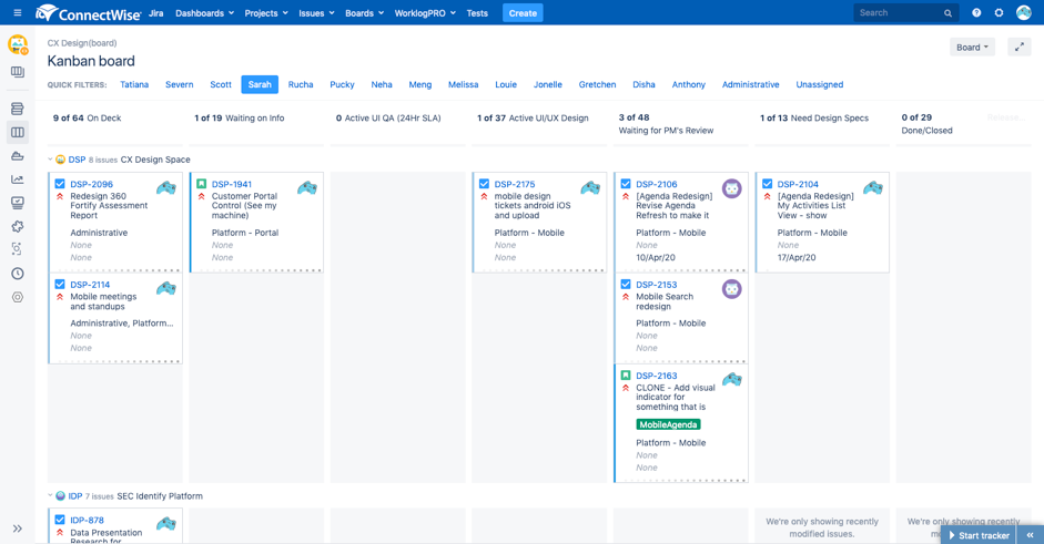
The features that need implementation are then assigned as tickets in Jira with acceptible criteria and details to help me as the designer make informed design decisions. Tickets are organized by Kanban style to help streamline the design process.
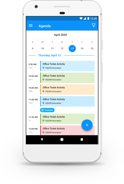
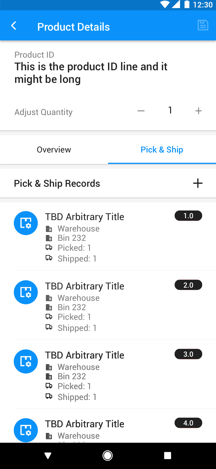
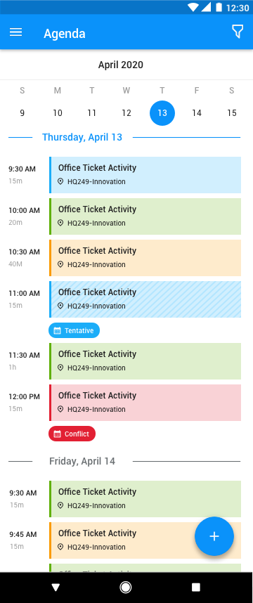
Once I receive the ticket, I try to make informed design decisions from data, feedback, best design practices, and compare interface and interaction patterns from other apps on the market. For example, I was tasked with redesigning the agenda screen to include calendar features. I researched the market for calendar apps and compare their agenda screens.
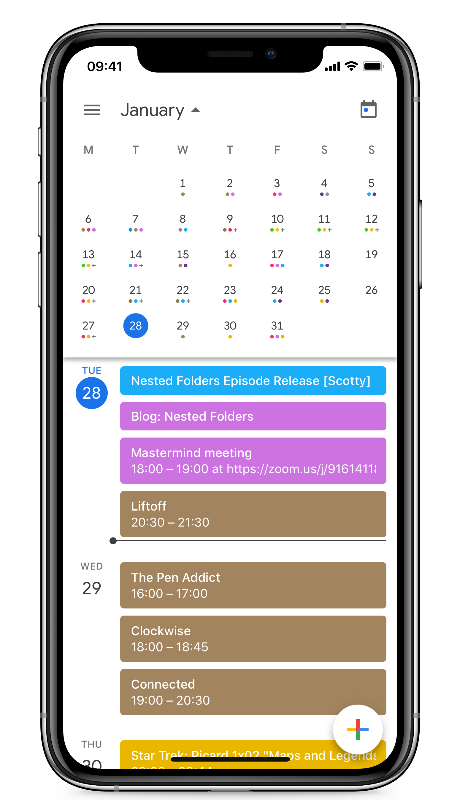
I used Sketch to produce the high-fidelity mockups that would meet the acceptance criteria while also adhering to the design system parameters and technical restraints. I usually design two or three versions and upload to Zeplin for the PM and developers to view. Then we would have feedback sessions to review the designs. When we can't reach a conclusion, I'd put together the mockups to send out to partners to further validate designs and garner feedback to iterate before handing off designs to developers. Here are a couple of screens to showcase the visual designs I did for the mobile app.
.png)
.png)
%20Agenda%20activities%20list%20view%20quick%20filter%20unselected.png)
%20add%20activities%20FAB.png)
.png)
.png)
Here's a prototye that I built in Invision for usertesting and interaction for the agenda redesign feature.
I learned so much of myself and what I was capable of during my time working at ConnectWise. Working in multiple teams has greatly improved my time and project management in an agile framework. I'm grateful that my experience on the mobile team has taught me how to communicate with the Product Managers and developers and lead design ideation for several agile dev teams.
Because of the foundation and design system already in place, it was easy for me to assimilate into the project and take on the responsibilities as the primary designers like many before me on the project. It also validated my love of designing mobile applications.