Orlando Patient Portal
UI/UX Design
Redesign of the Orlando Patient Portal to reflect brand and increase patient engagement.
Redesign of the Orlando Patient Portal to reflect brand and increase patient engagement.
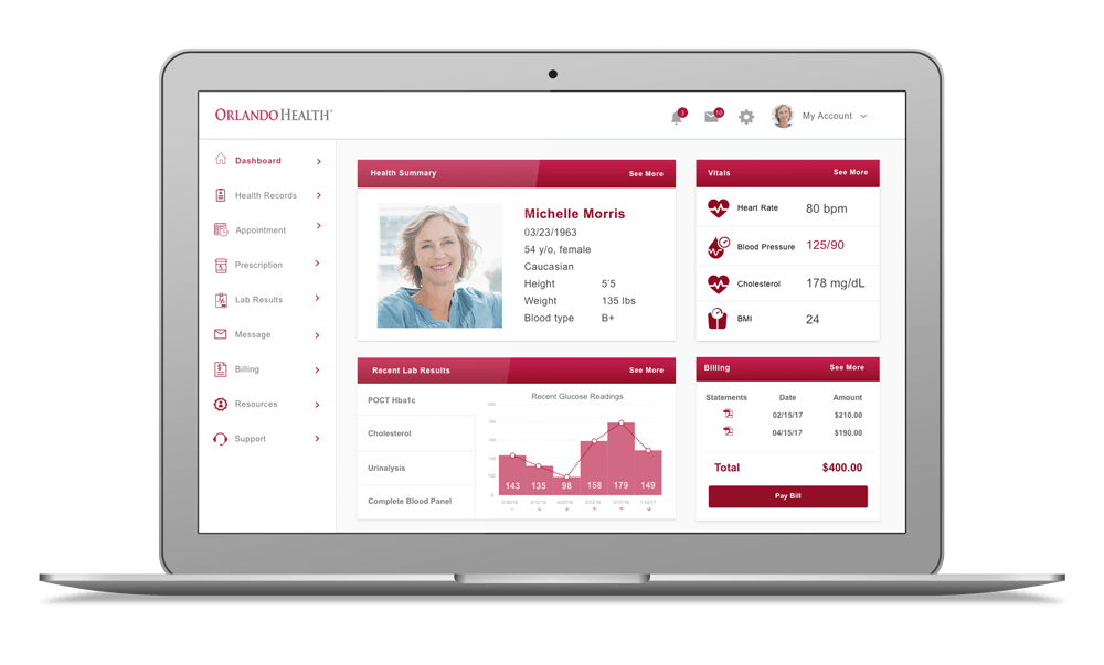
Orlando Health is one of Florida’s most comprehensive private, not-for-profit healthcare systems providing access to nearly two million Central Florida residents. Their free online patient portal provides a convenient and secure way to manage their patient health information.
I wanted to redesign the portal as a self-exploration project to apply UX principles and best practices and redesign it to be more user friendly.
My Role:
User Research, Interaction, Visual design, Prototyping & Testing
Duration:
Sept 2017 - Dec 2017
Tools:
Photoshop, Sketch, InDesign, InVision
This challenge is to redesign the patient portal interfacee to reflect the Orlando Health website brand. My research found published studies and surveys about the patient portal studies and patient engagement, and I used the results to bridge the functionality of the portal with a more user friendly interface that would increase patient engagement.
I conducted research on the current and potential target market and found information from surveys and published articles with statistics for boomers and millennials. Source


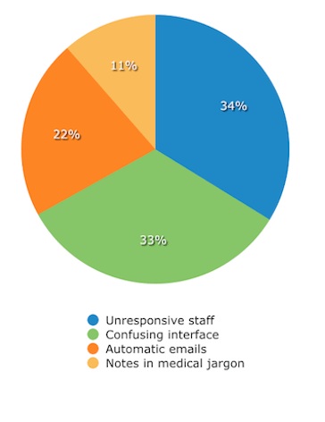
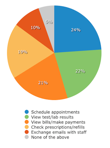
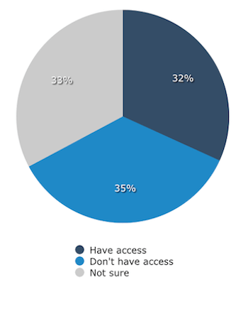
A survey was conducted by a company, Software Advice, to find out the most used features for a patient portal. A random sample of 1,540 U.S. patients, collecting a minimum of 385 responses to each question. Here is a highlight of the most important findings. Source
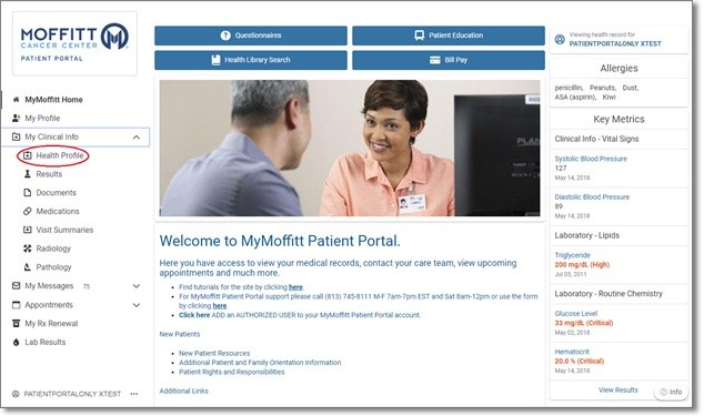
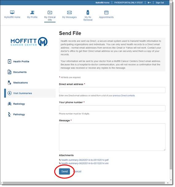
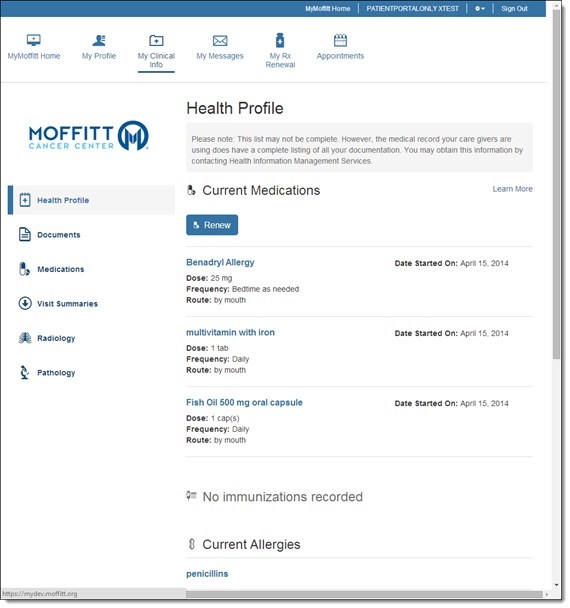
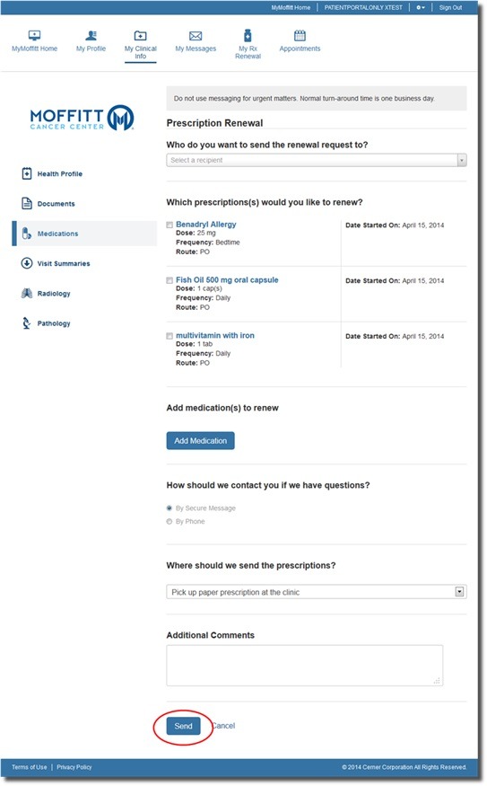
H. Lee Moffitt Cancer Center & Research Institute is a nonprofit cancer treatment and research center located in Tampa, Florida. MyMoffitt Patient Portal is a free, secure web-based service that allows Moffitt Cancer center to access their information.
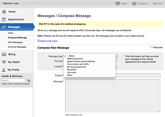
Athenahealth, Inc. is a publicly traded American company that provides network-enabled services for healthcare and point-of-care mobile apps to drive clinical and financial results for its hospital and ambulatory clients in the United States.
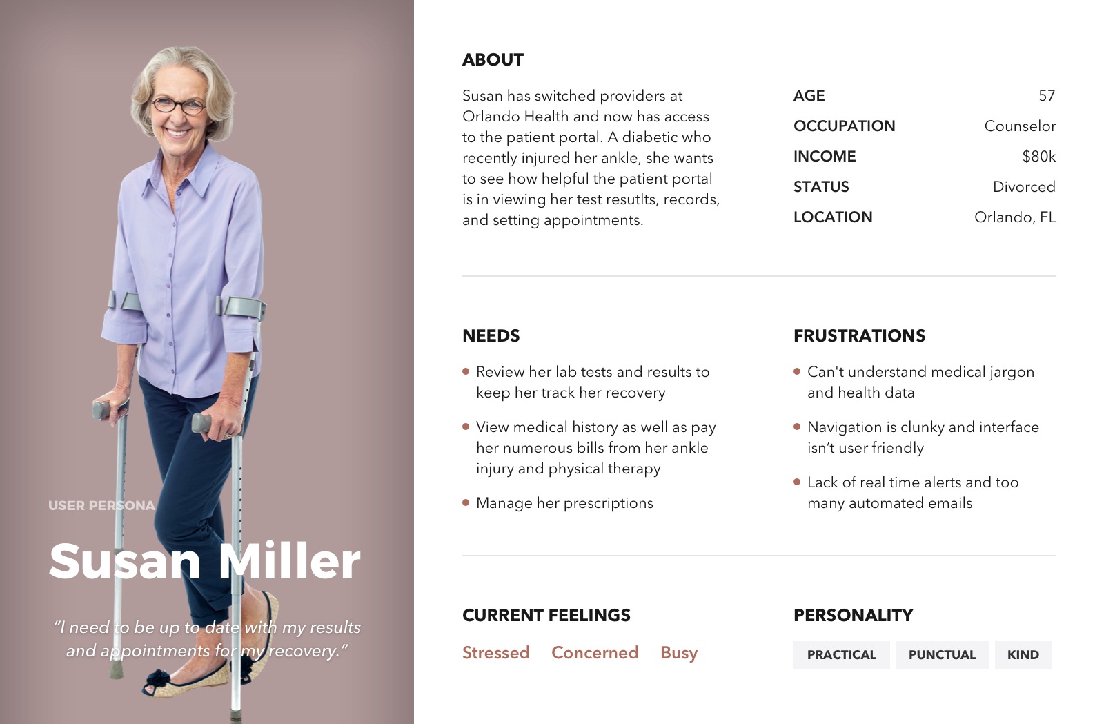
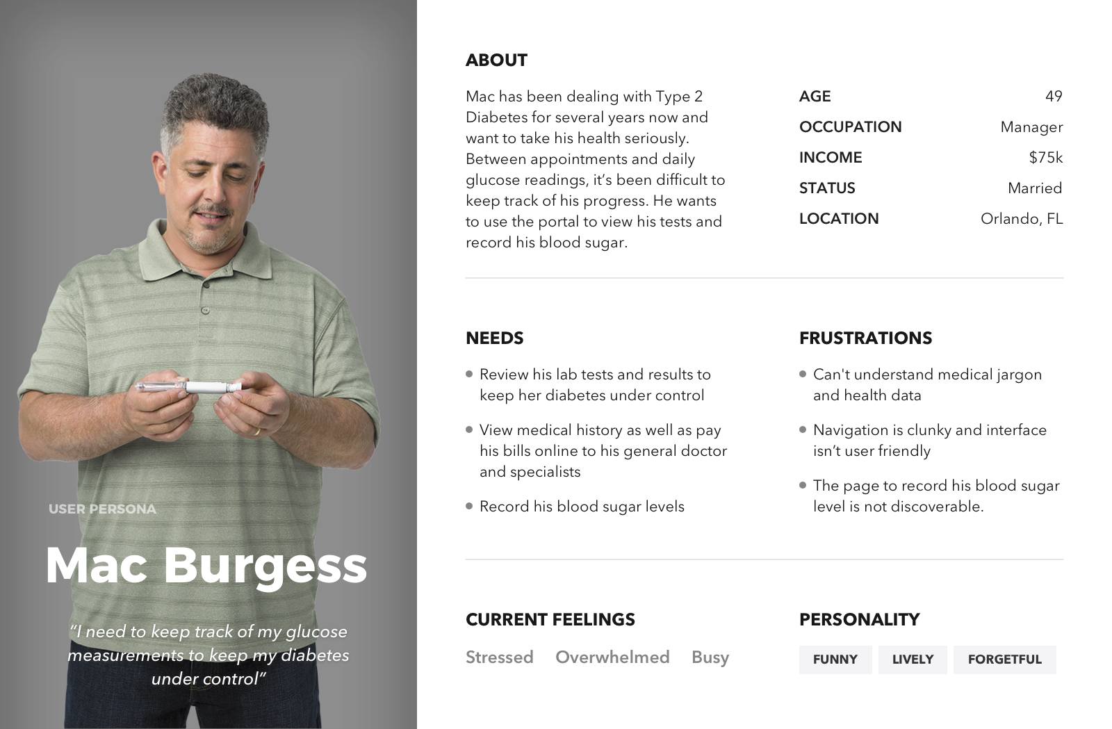
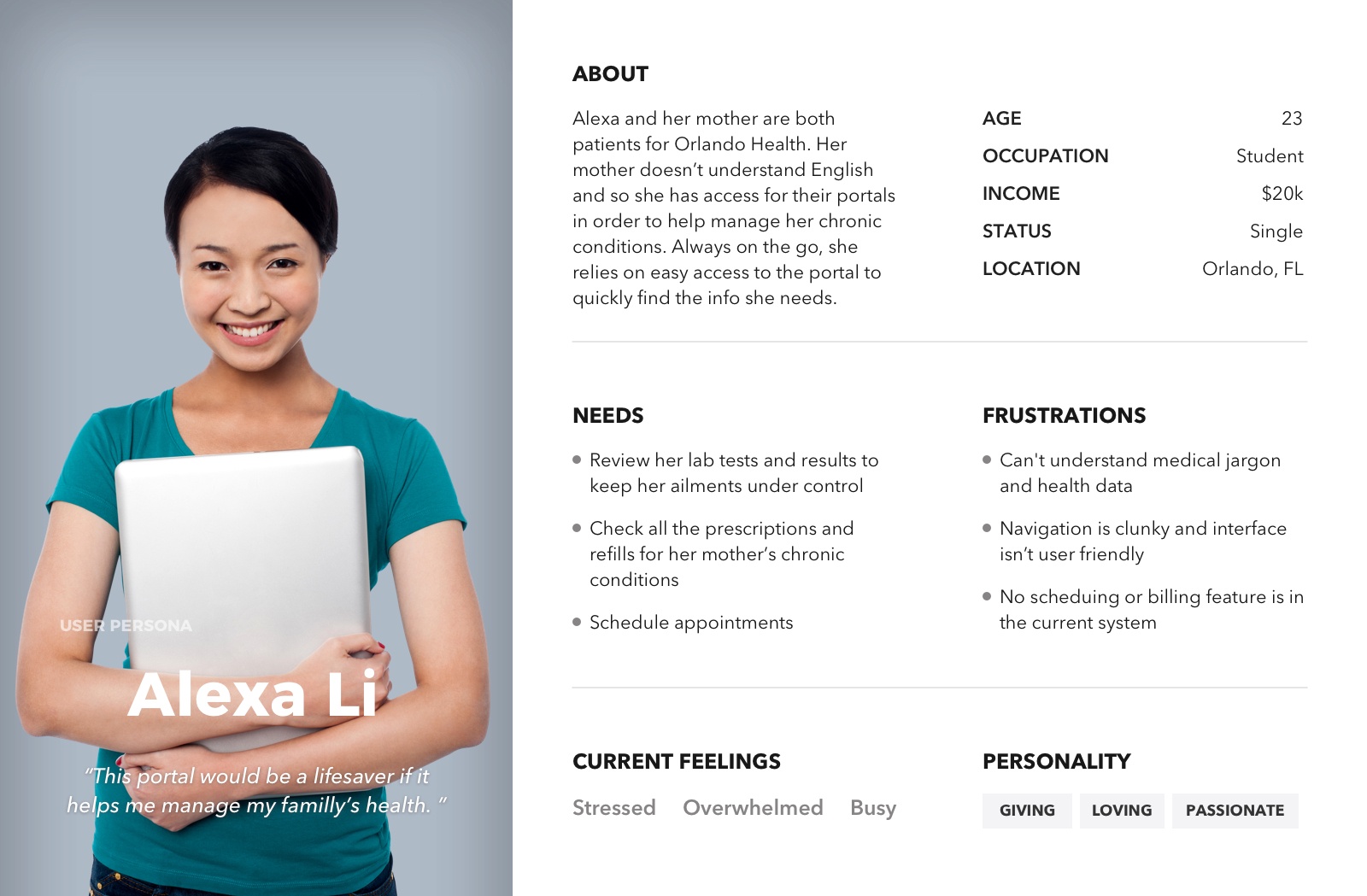
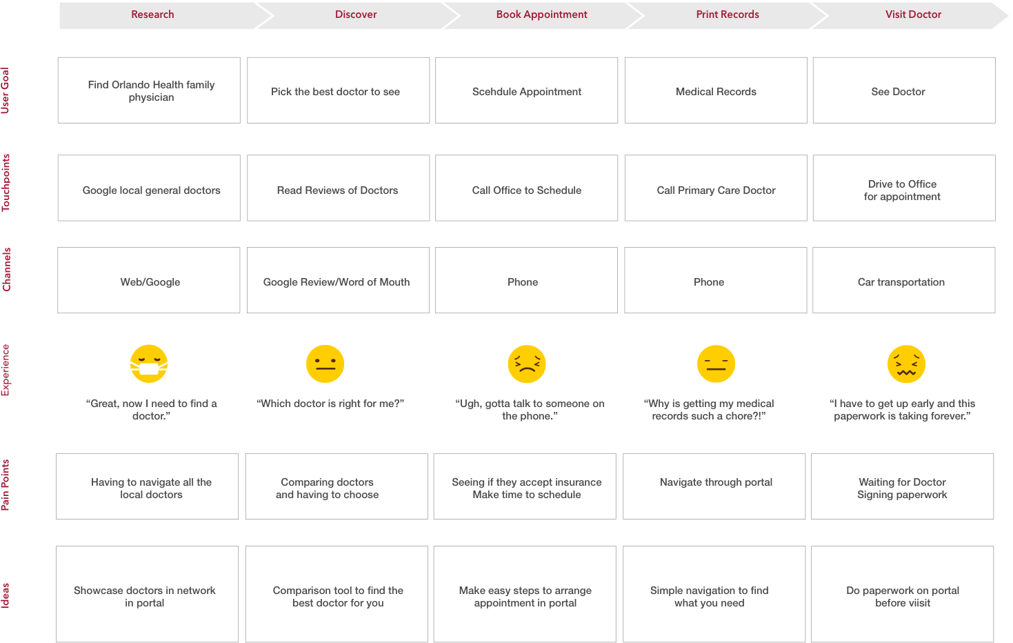
Seniors and people with complicated medical history are the main users of patient portals as indicated from research. I made three personas to reflect these type of users.


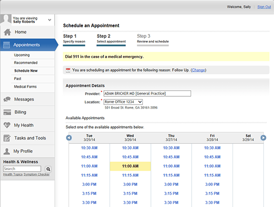
The Orlando Health patient portal is powered by FollowMyHealth. As it is only available to Orlando Health patients and providers, I interviewed a patient who had access to the portal.
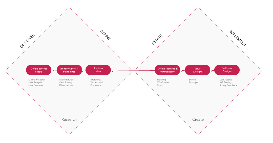
From all the research, surveys, and interviews and brainstorming session, I categorized the solutions for the problem space and what new features to add to the portal.

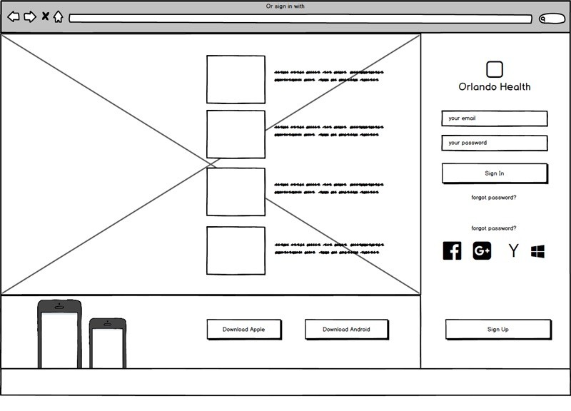
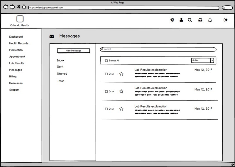
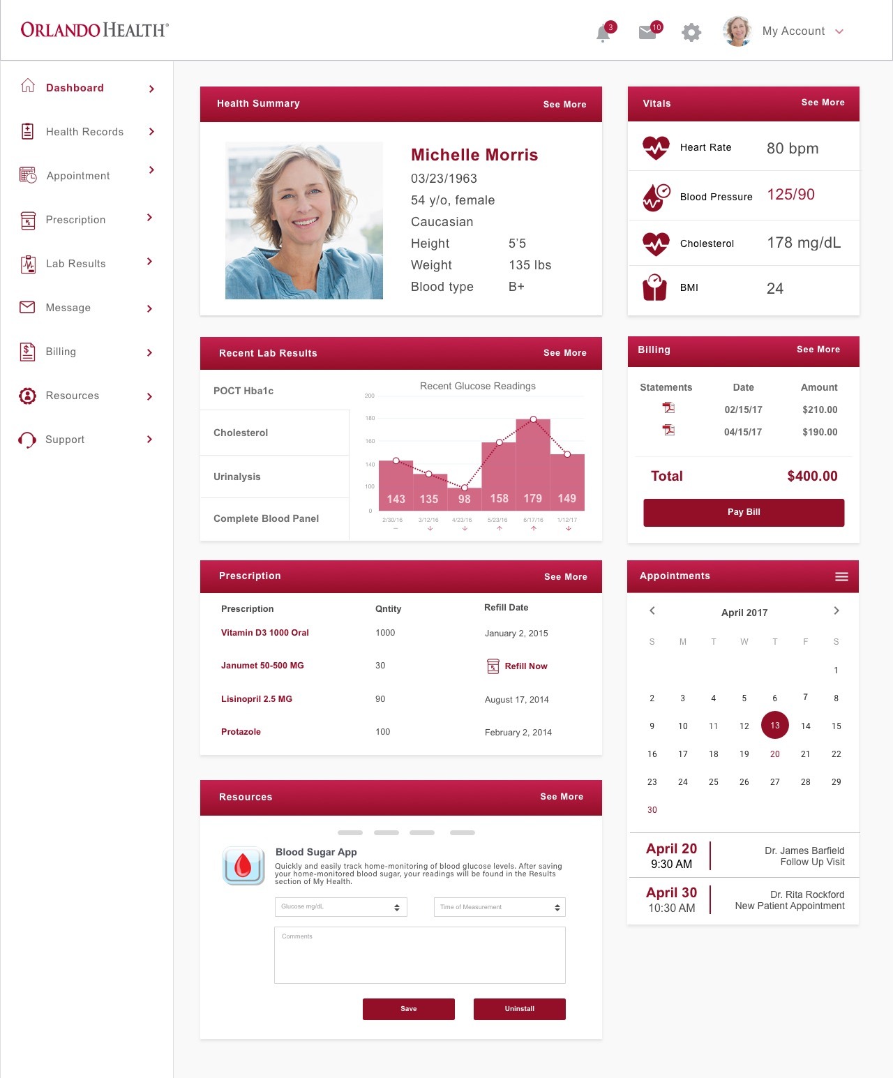
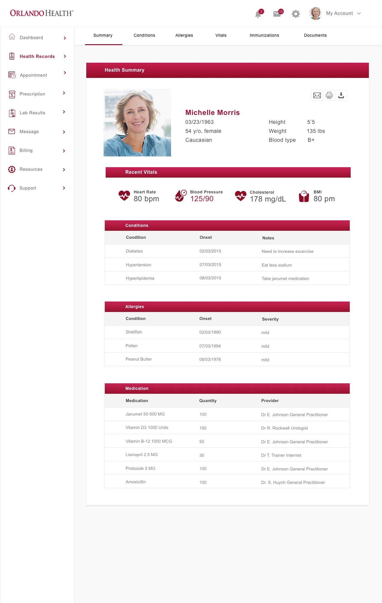
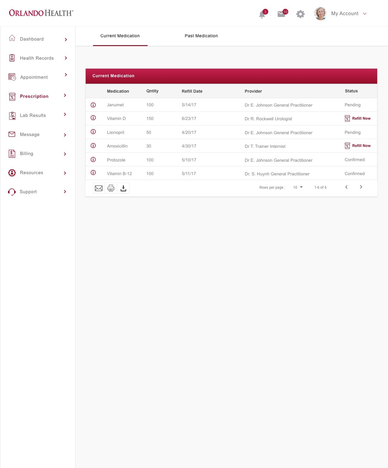
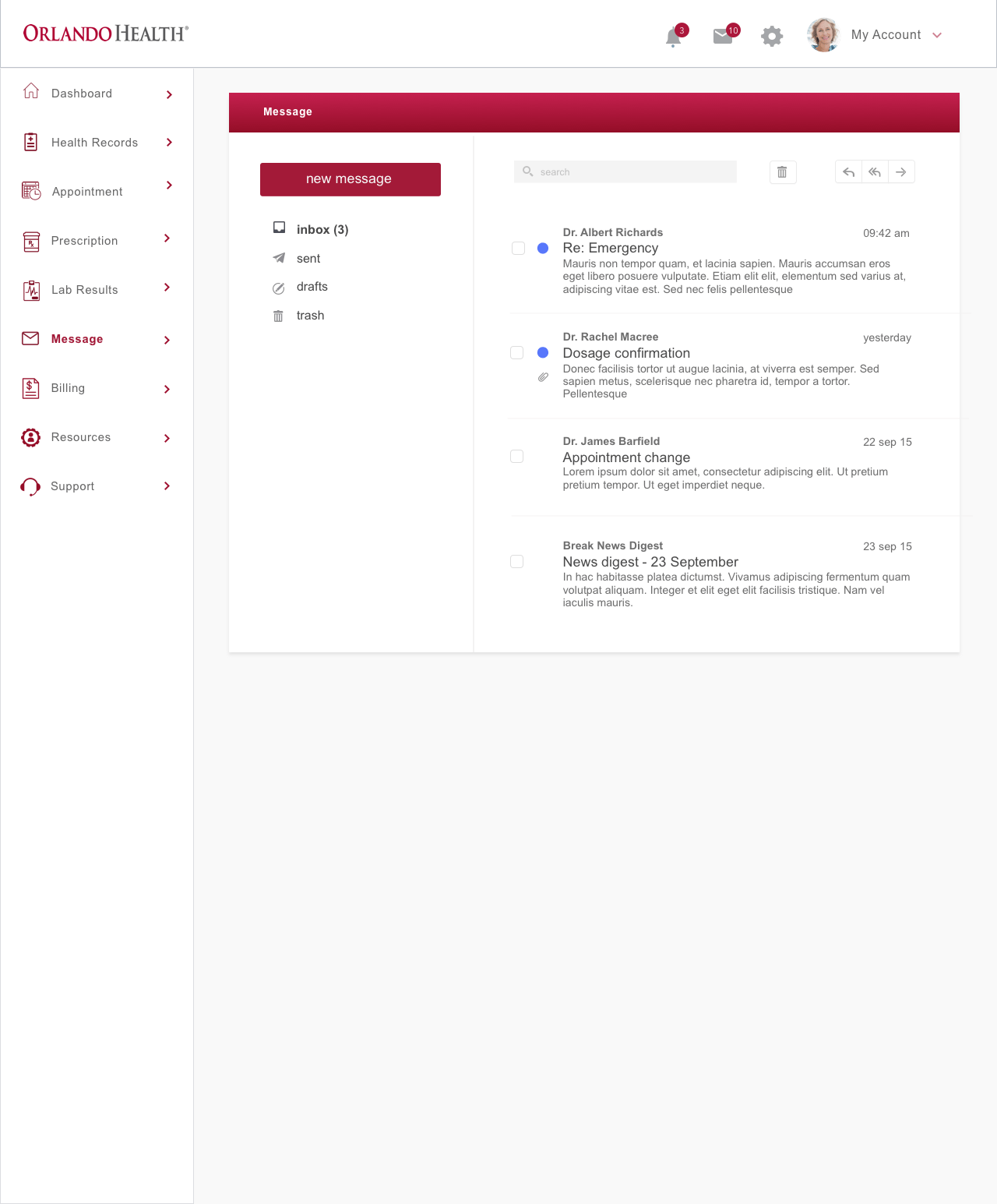
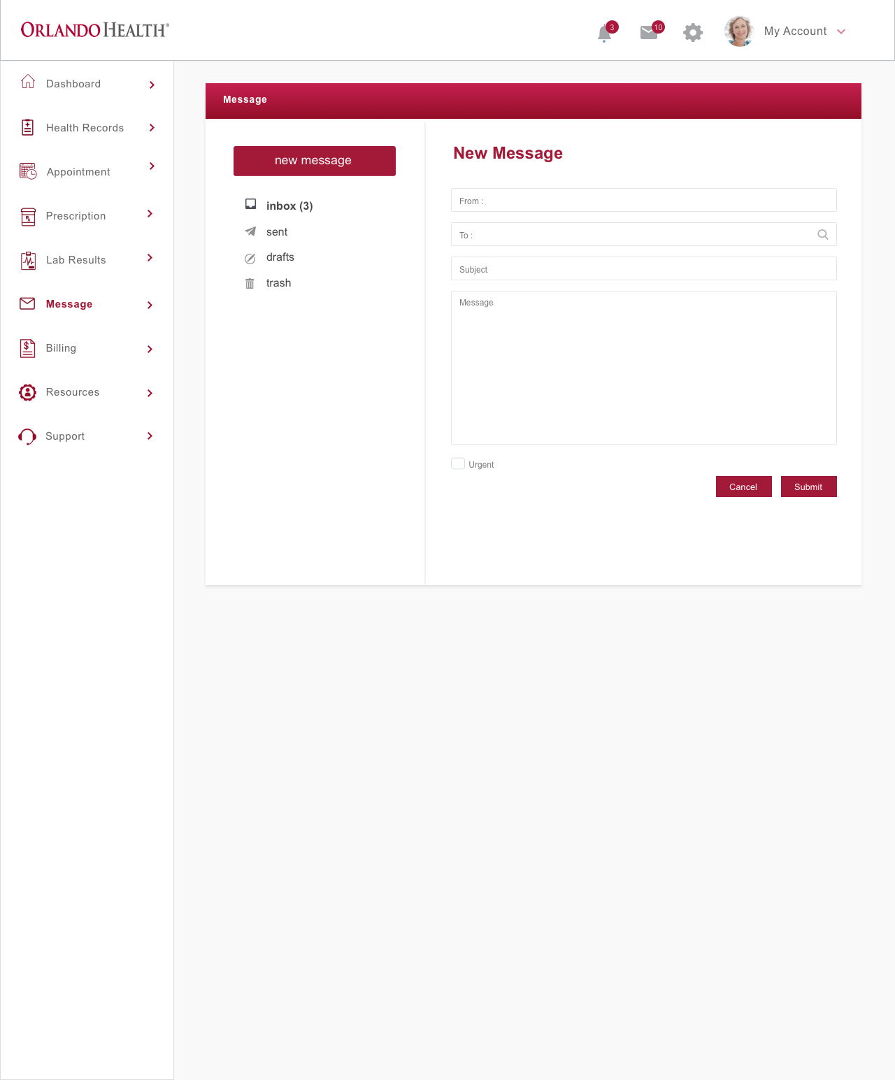
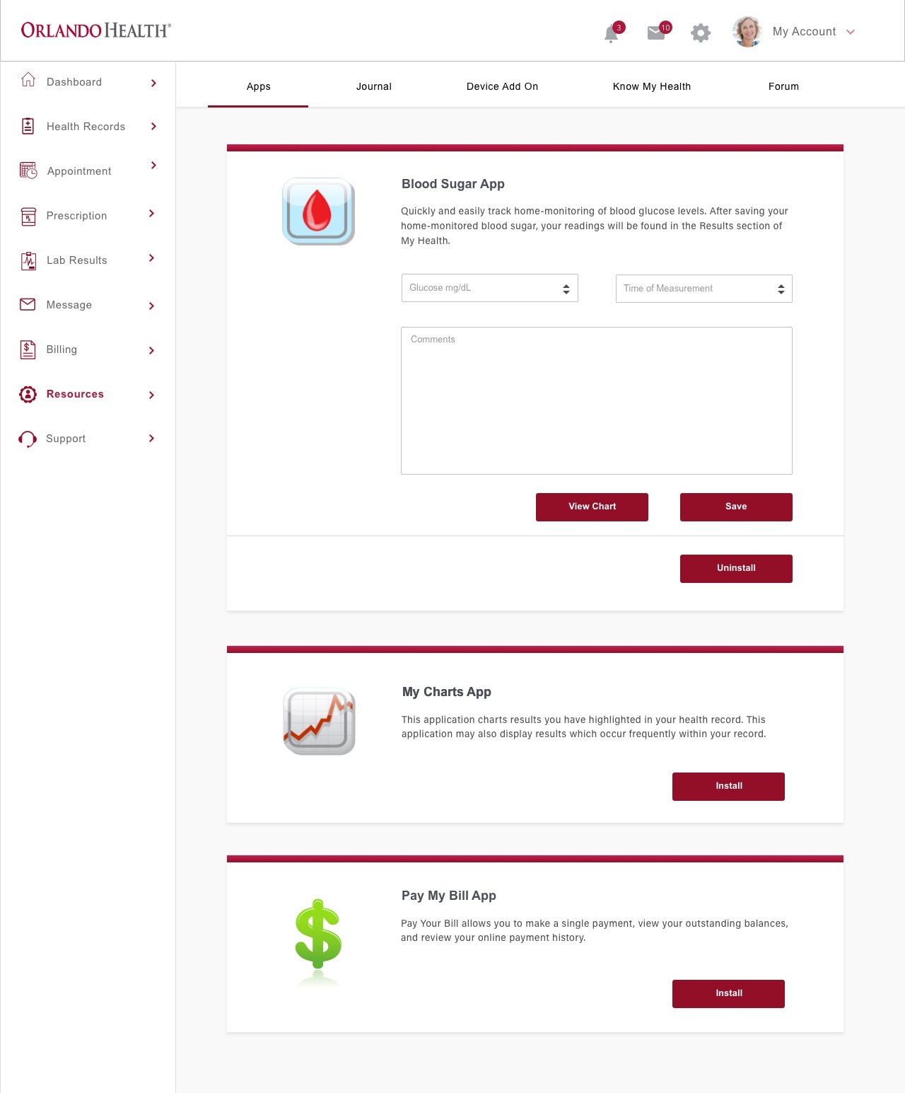
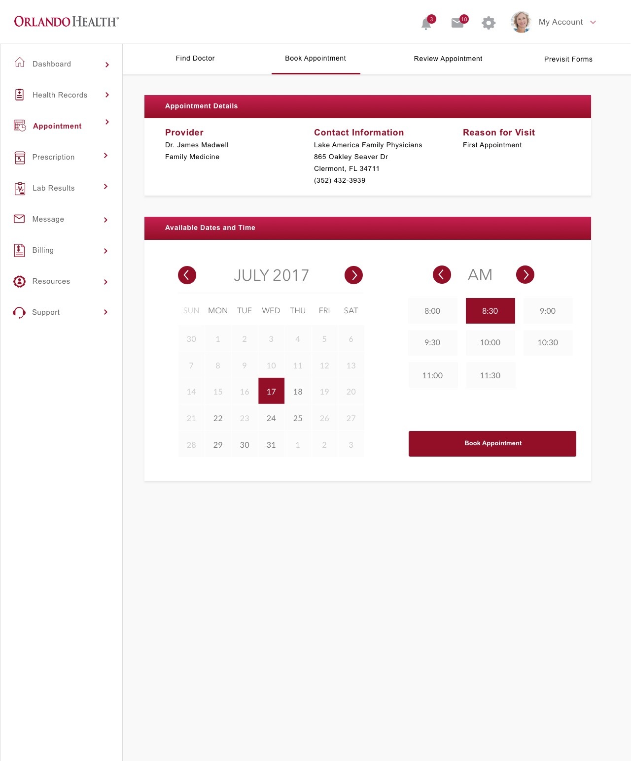
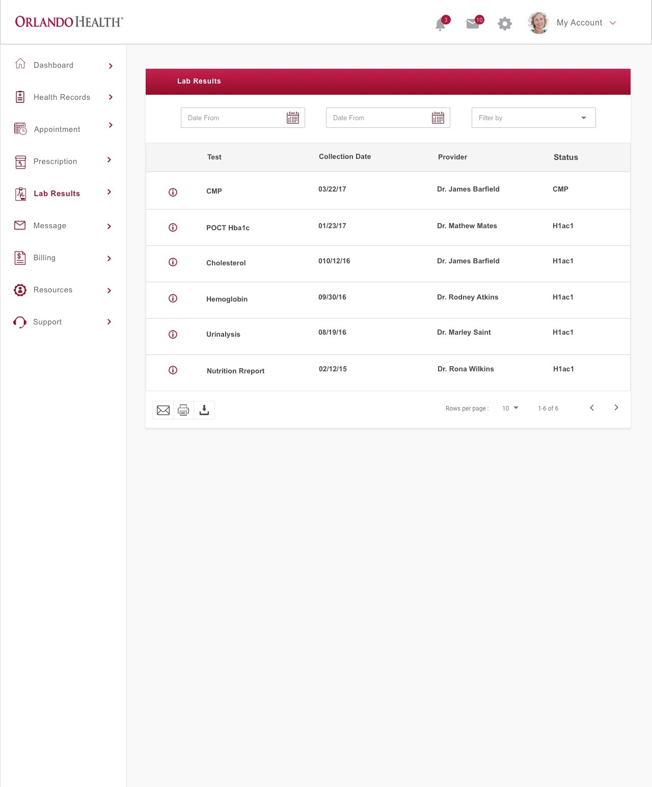
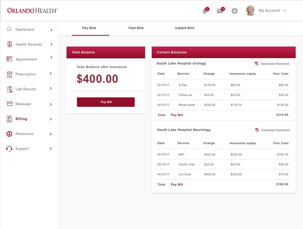
Following the F pattern layout, I changed navigation to the left menu since that's where the users eye tends to gravitate first. The navigation I had in mind would be like that of a dashboard. Changes I made are:
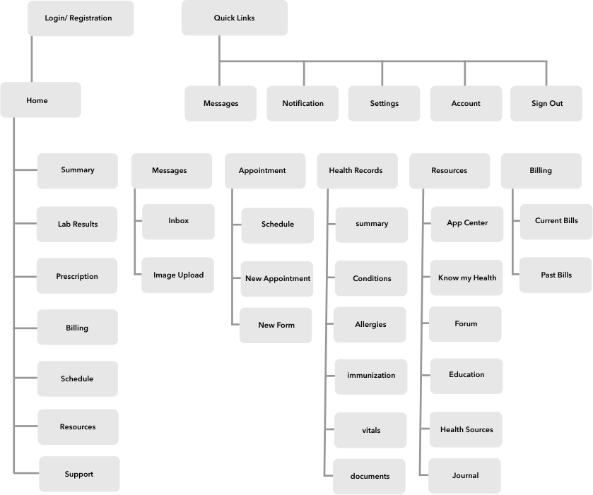
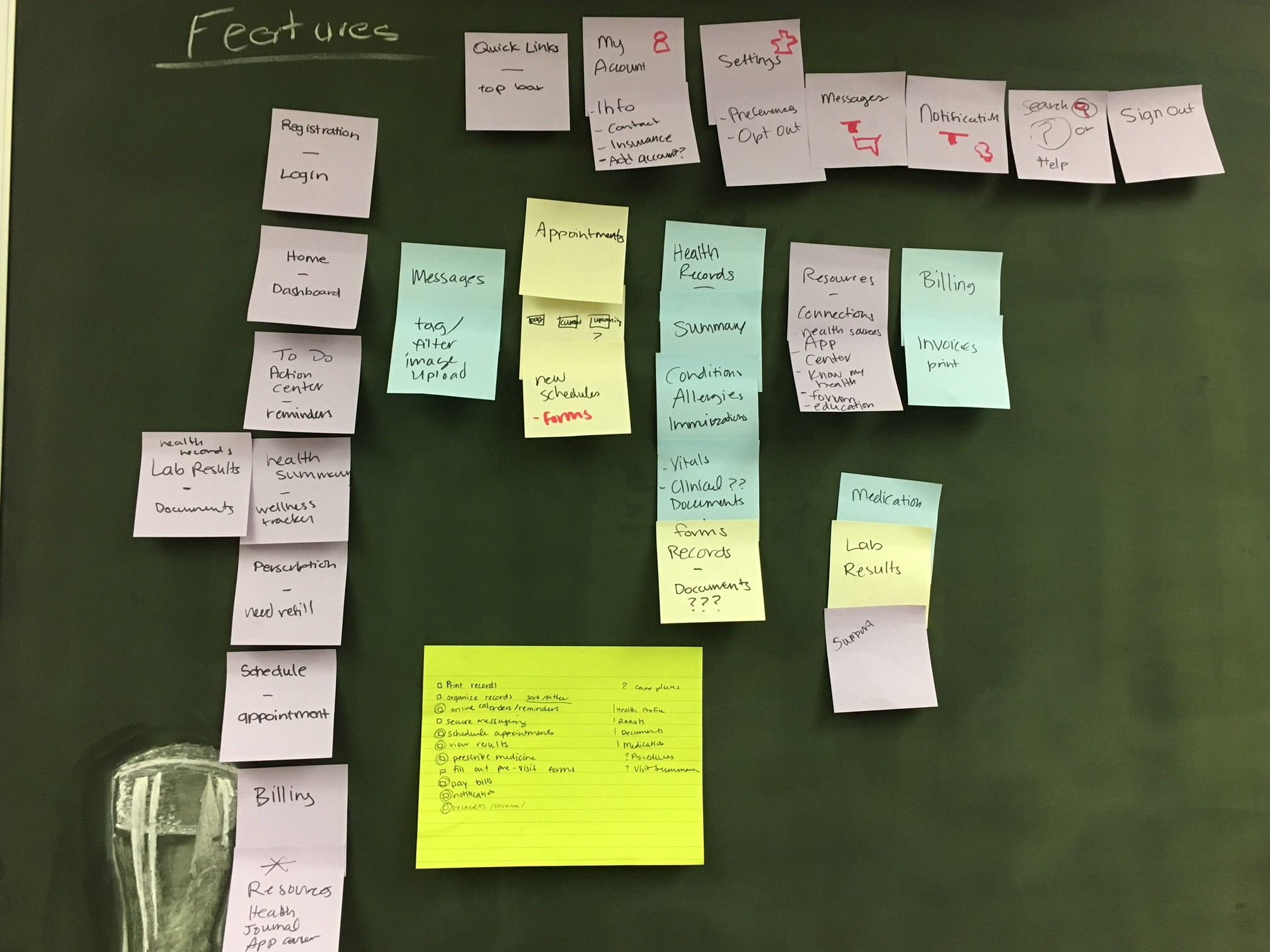
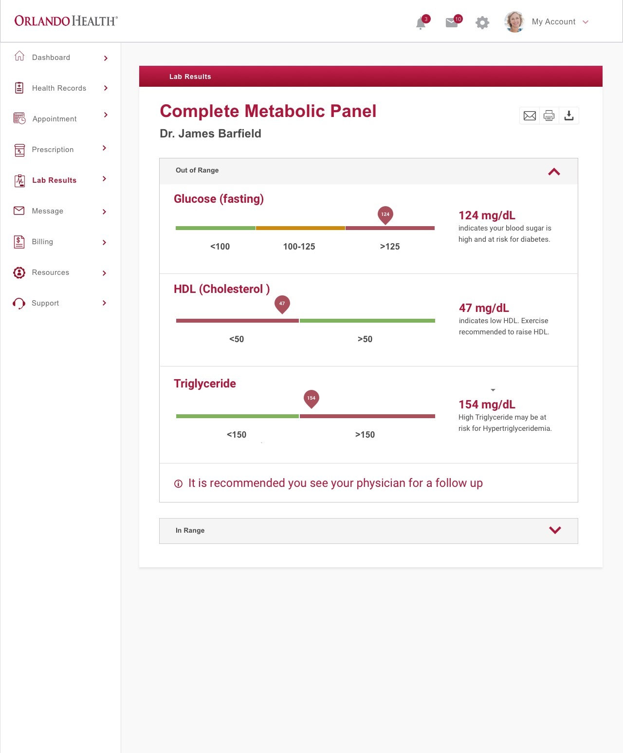
After I had a better understanding of user goals and behaviours, I have listed some key features of the portal below in order to create low-fidelity wireframes.
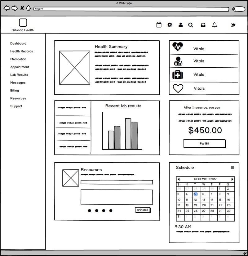
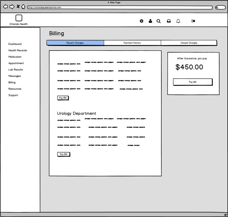
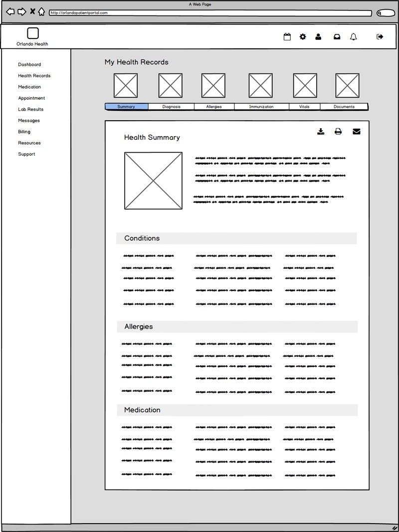
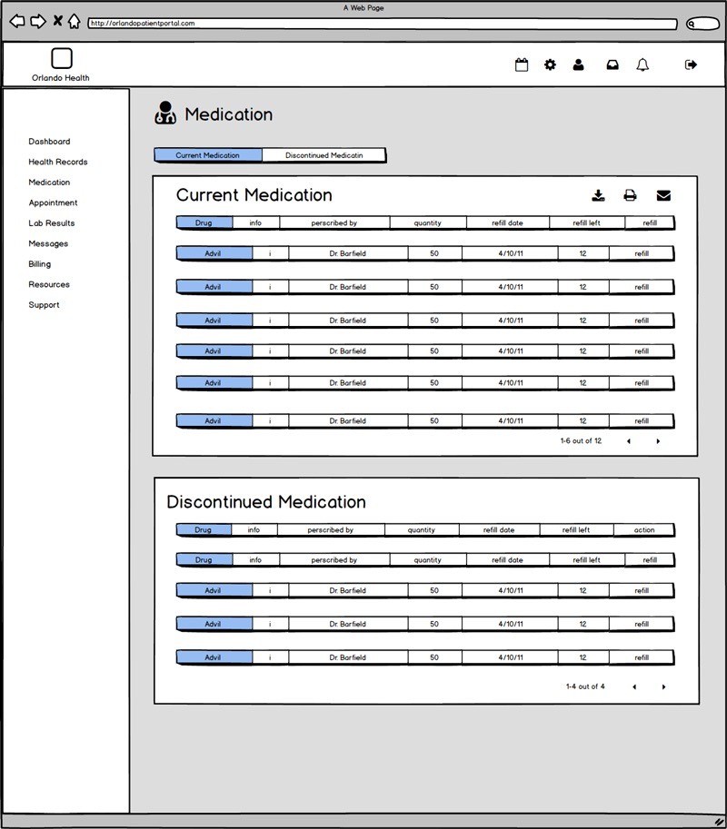
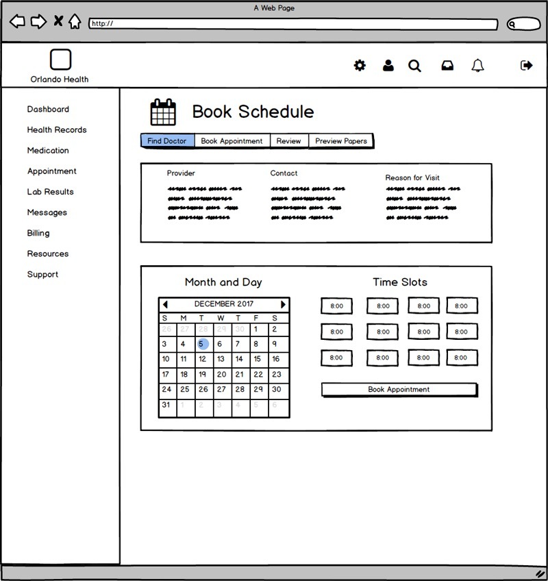
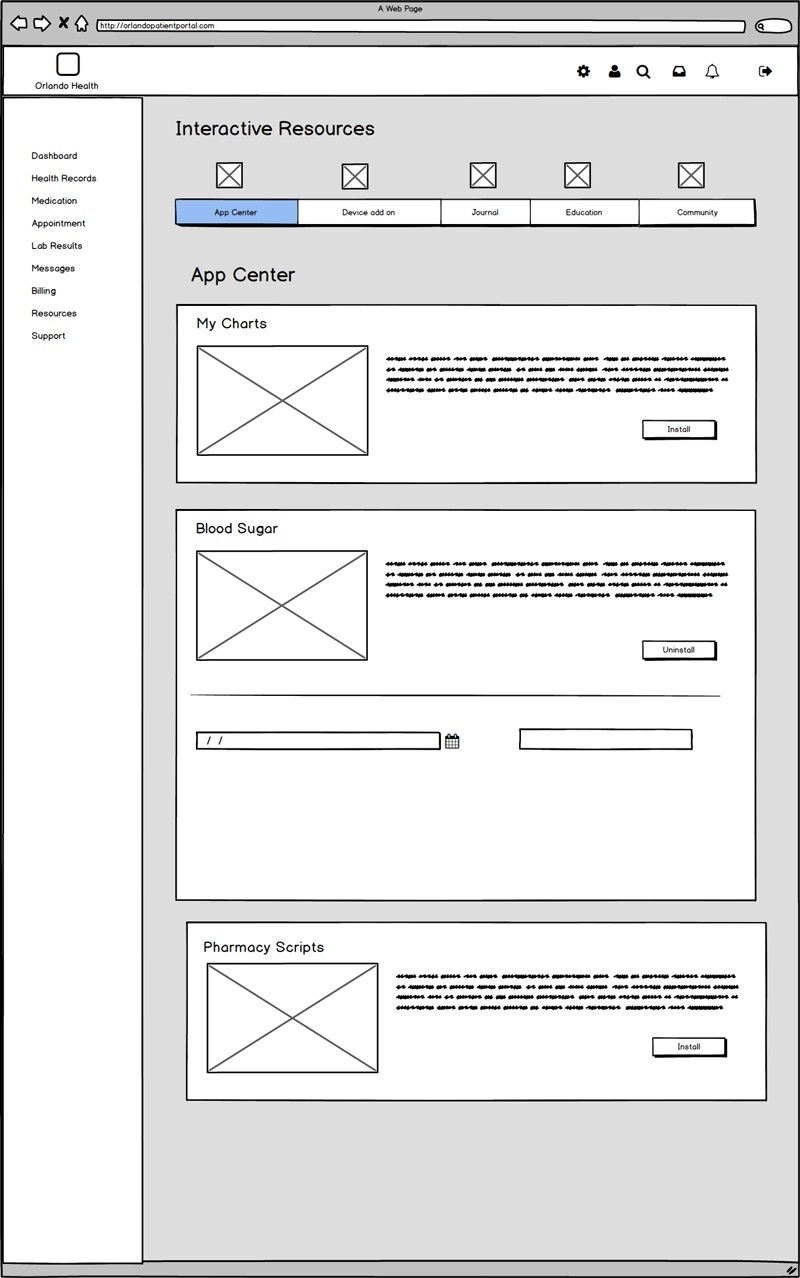
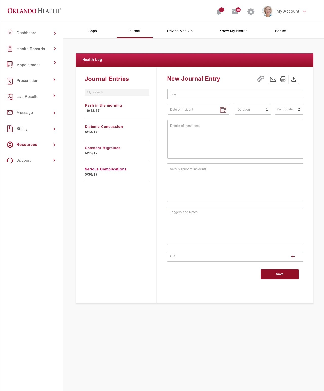
The high fidelity mockups were done in sketch. I took into consideration to stay within the bounds of the Orlando Health. While brainstorming for each screen, I also reviewed existing interfaces for certain features and functionalities.

2/5 users found the health journal. The navigation and layout didn't make finding the journal apparent.

4/5 found the journal. They had to go to resources and the submenu to see it.
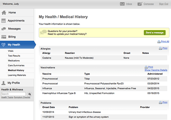
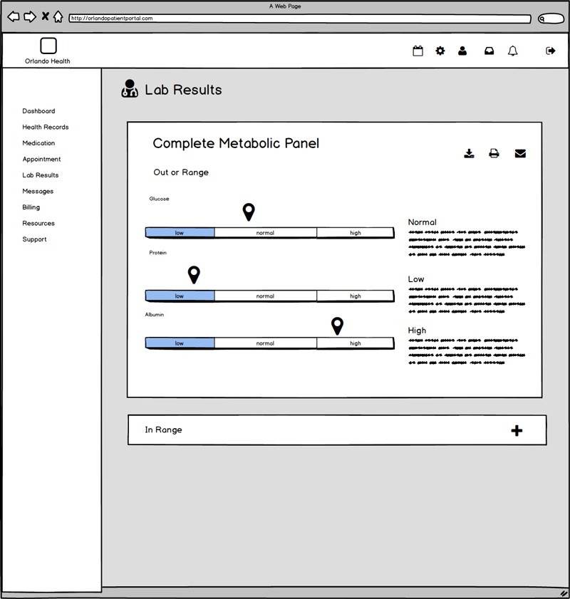
4/5 found their lab results hidden in myHealth section.

5/5 could easily find their way to the lab results from the global navigation.
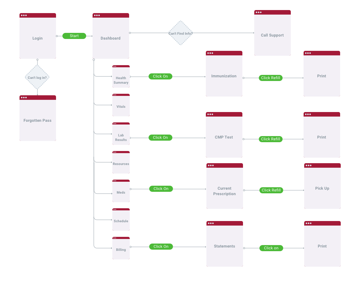
Here's a prototye that I built in Invision for usertesting and interaction.
Designing for this health portal was by far the most difficult project to undertake for me. Taking into consideration all the features the current portal lacked compared to the features that research indicated that users wanted to use in a portal, there I had to design several new screens.
In this project, I was working with limited time and so it was important for me to narrow down the target audience and focus on the problem that I was capable to solve. With all the features I had to add, it was easy to be overwhelmed and encounter the feature creep.
In interviewing my user and adding a feature for what she wanted, I should have taken a larger sample size and survey to see if was actually necessary. Although it is easy to assume what is best for the product, I learned the importance of not relying on my own assumptions and to constantly validate my own ideas with user feedback.