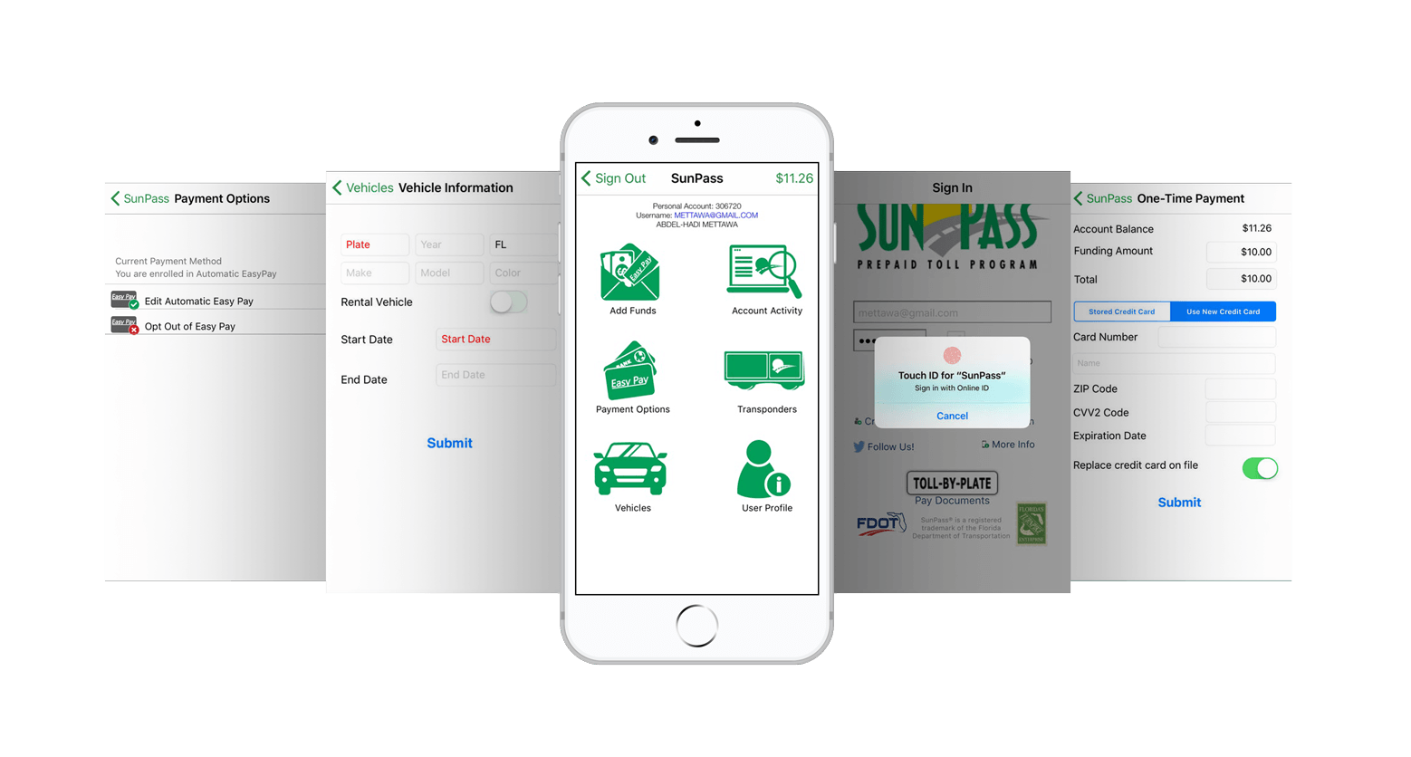
SunPass is the Florida Department of Transportation’s innovative Prepaid Toll Program. SunPass customers typically pay less than cash customers at most toll plazas and exits on Turnpike roads. They currently have a website and app to for customers to pay their tolls.
The objective is to explore the human-centered design process and research the user needs in order to redesign the app that would result in increase consumer engagement and expansion of brand awareness.
My Role:
User Research, Interaction, Visual design, Prototyping & Testing
Duration:
Oct 2017 - Dec 2017
Tools:
Photoshop, Sketch, InDesign, InVision
The Sunpass App’s functionality is limited compared to the website and customers have complained of low loading times and bug issues, resulting in a customer rating of 2.9/5 stars. Being Sunpass user myself, I downloaded the app to review its interface and functionality. I decided to take on this exploration project as practice redesigning and expanding an existing interface.

According to Sunpass, only 81% of users participate in the Sunpass program. Participation peaked in urban areas where there are more commuters.
This application crashes constantly and leaves me having to pay from home. Not helpful when you’re on the road. Needs to be made more user-friendly and fixed all the bugs and glitches.

I gathered user feedback by taking my phone with the downloaded SunPass app into the Valencia Graphics Lab room and asked fellow students and Sunpass users for their thoughts.

I viewed the Sunpass app on online app stores to review the feedbacks from reviews. The current score on the is 2.9/5 stars, and most complaints are due to functionality and usability problems.

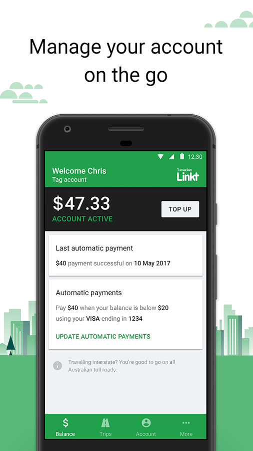
To define problems of existing solutions, I conducted competitive analysis of existing applications that has similar functions and goals of Sunpass.
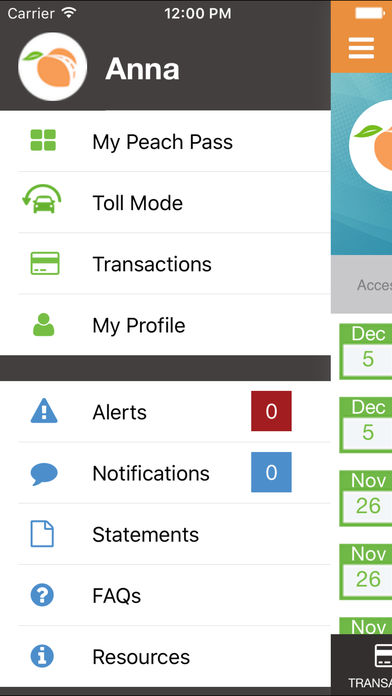
The Peach Pass is connected with the State Road and Tollway Authority (SRTA) and automatically deducts tolls when using the electronic toll lanes of the Georgia Express Lanes.
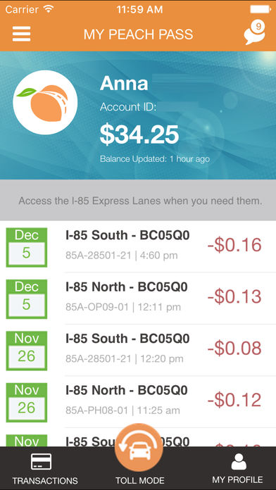
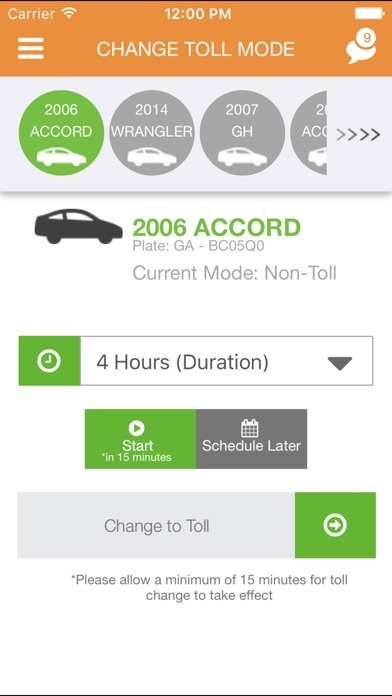
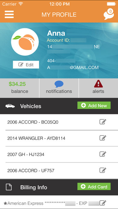
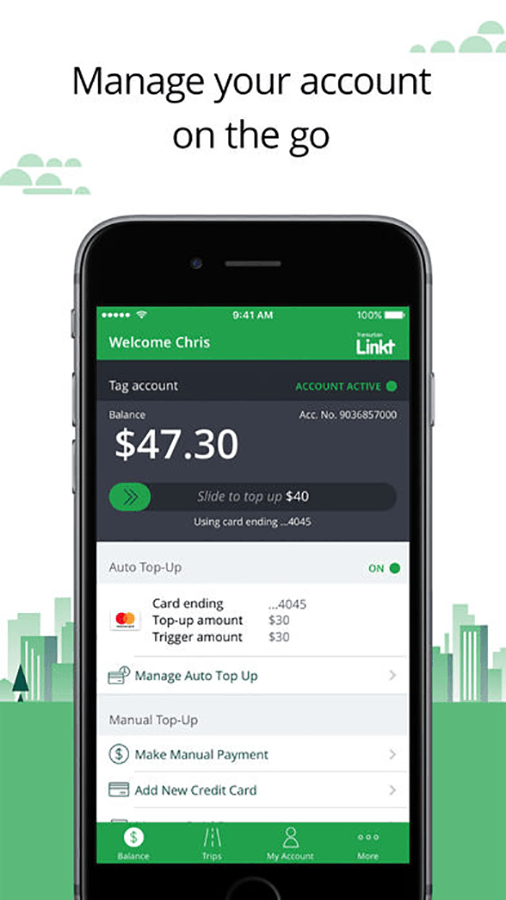
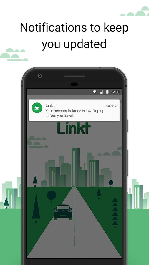
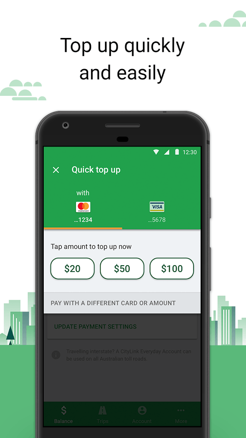
Established in 1996, Transurban is an Australian company that manages and develops toll road networks in Australia and the United States.
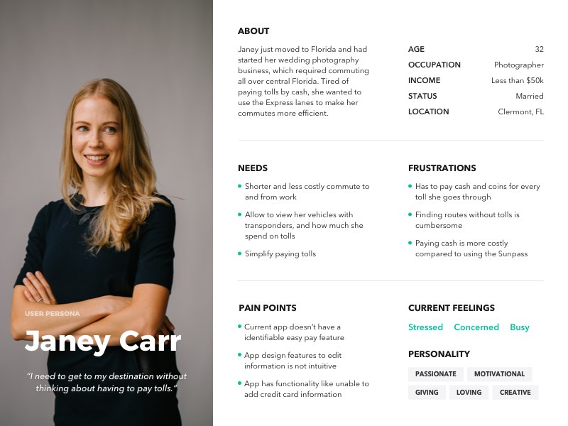
Target audience for app are Florida residents and tourists, especially in urban areas. Guerilla Interviews helped me determine what the granualar motivations and frustrations for general Sunpass Users.
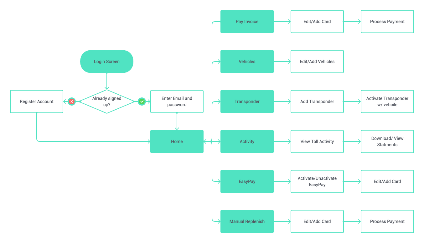
According to Sunpass, only 81% of users participate in the Sunpass program. Participation peaked in urban areas where there are more commuters.



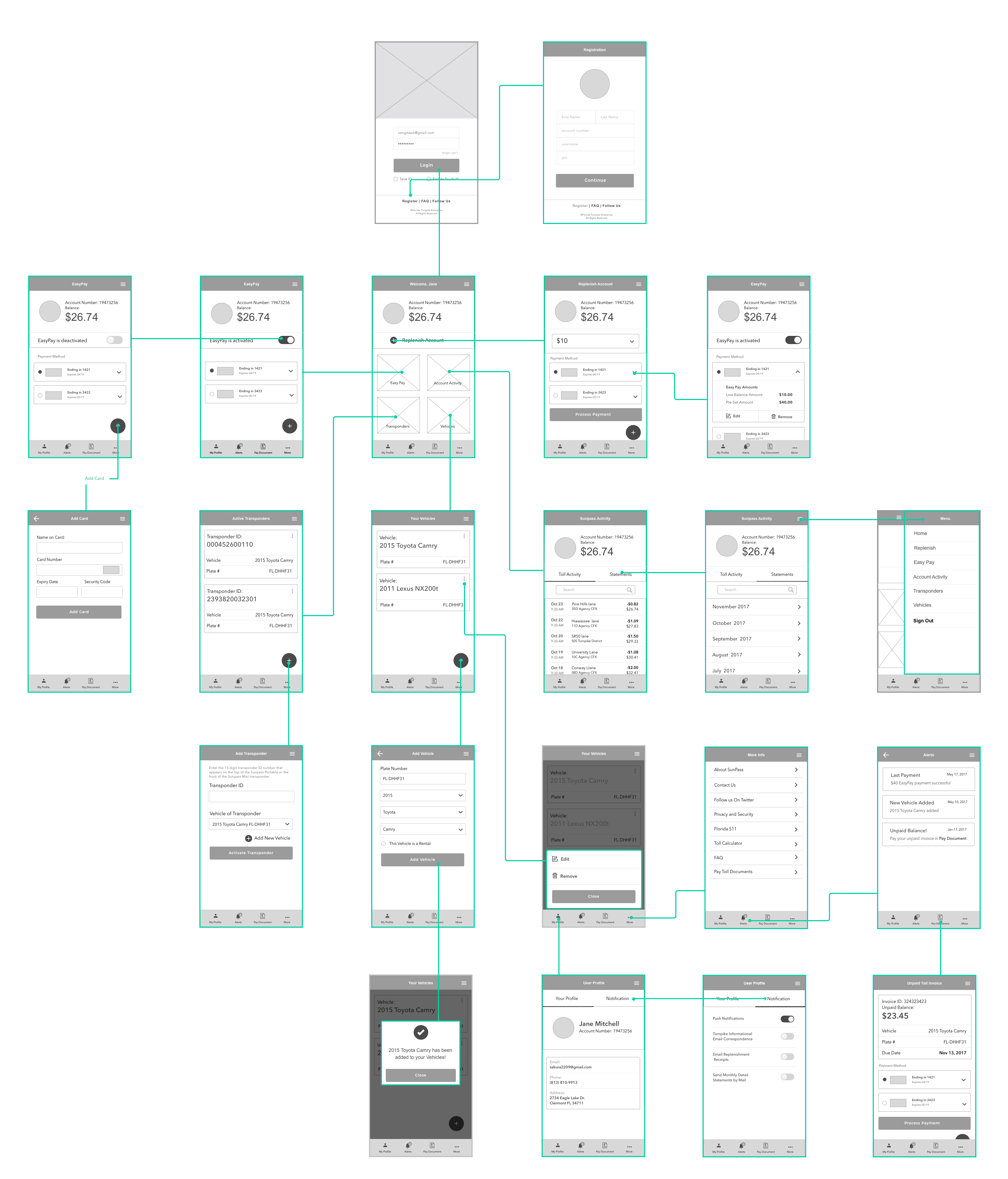
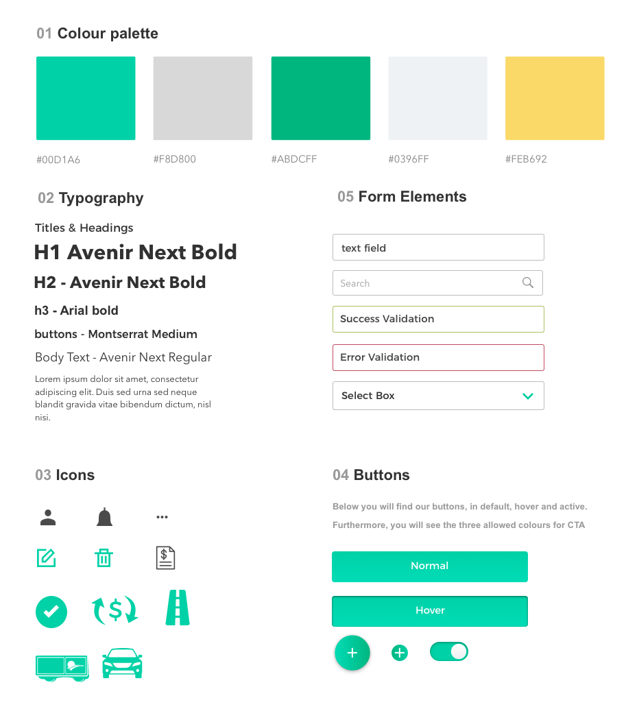
Wireframes were done in sketch for the Sunpass app. While brainstorming for each screen, I also reviewed existing interfaces for certain features and functionalities.
I designed the high-fidelity mockups in Sketch and wanted to showcase the differences between the old Sunpass design vs the new interface designs and the the solutions to each problem.
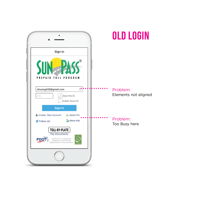
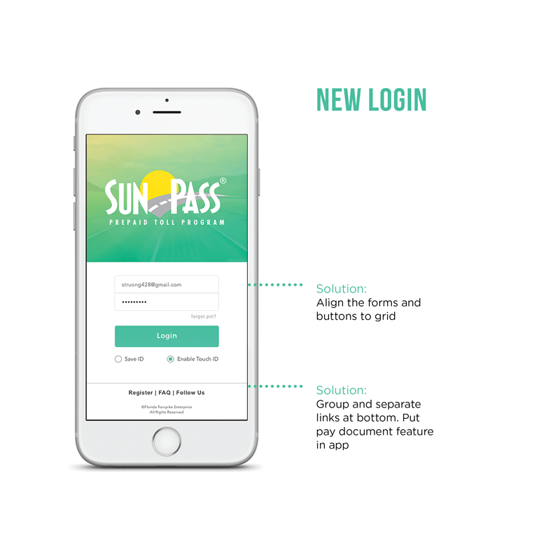
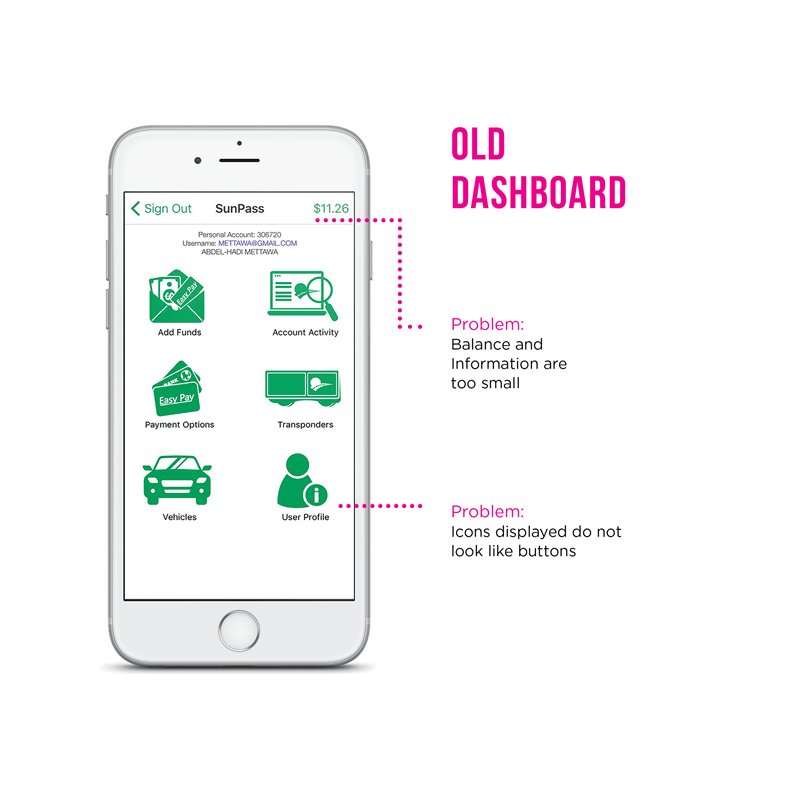
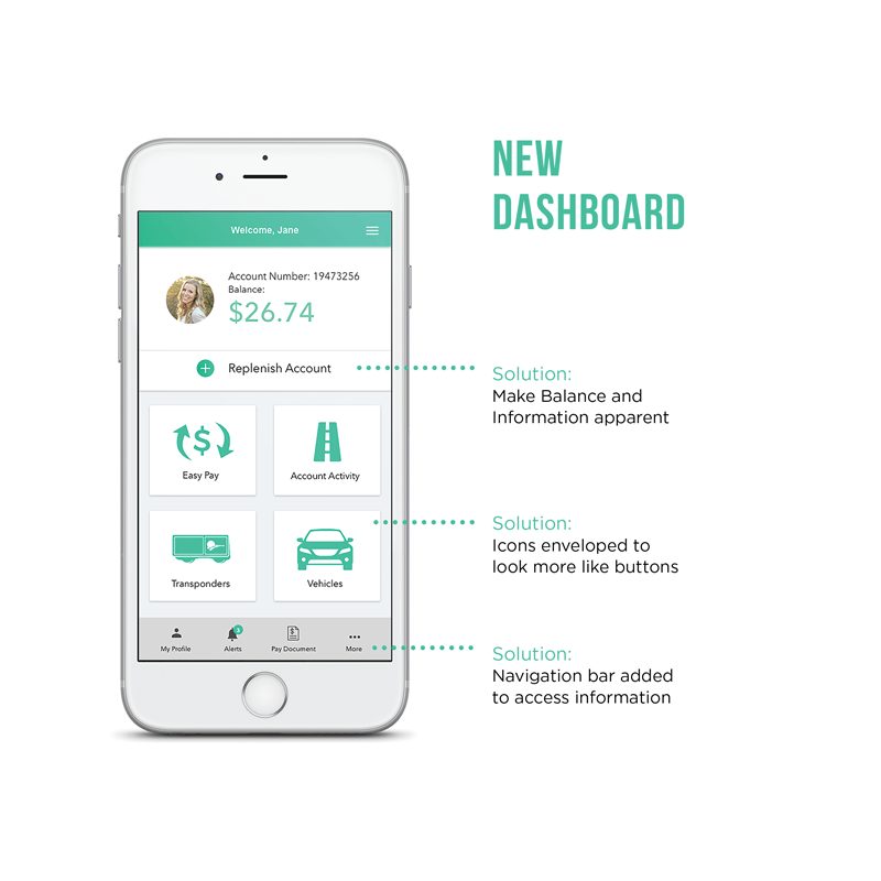
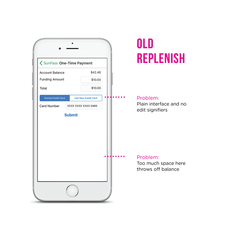
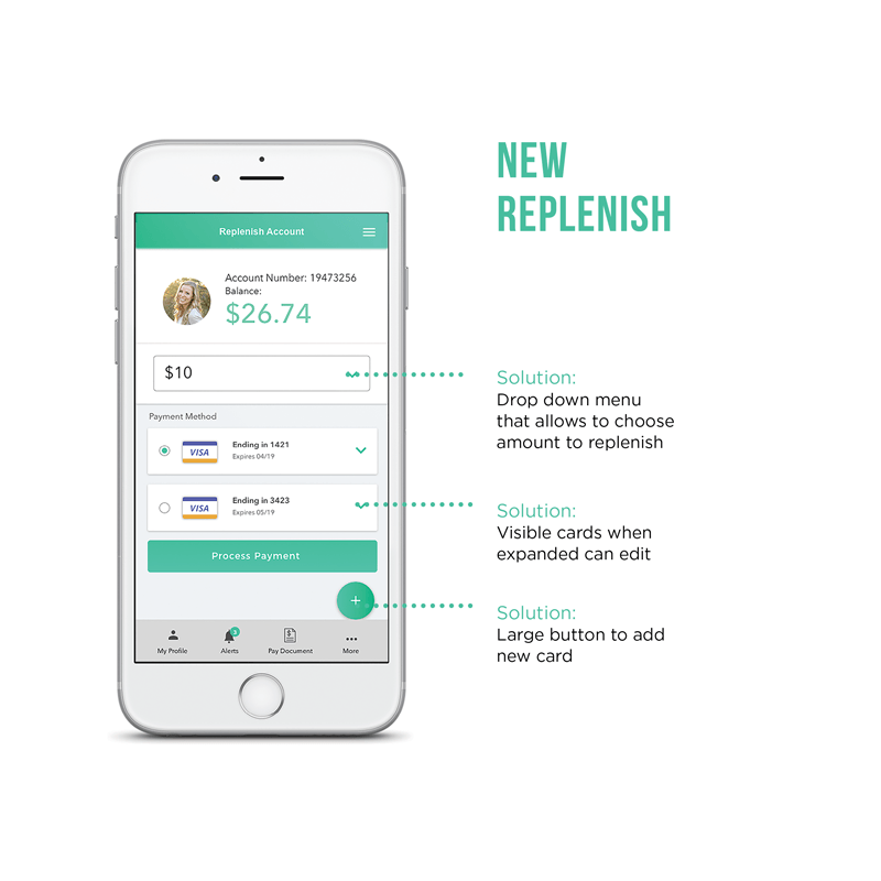
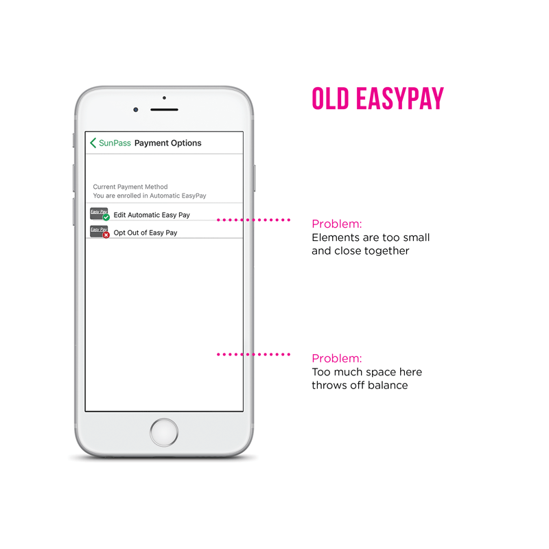
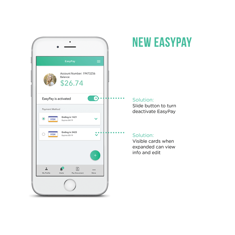
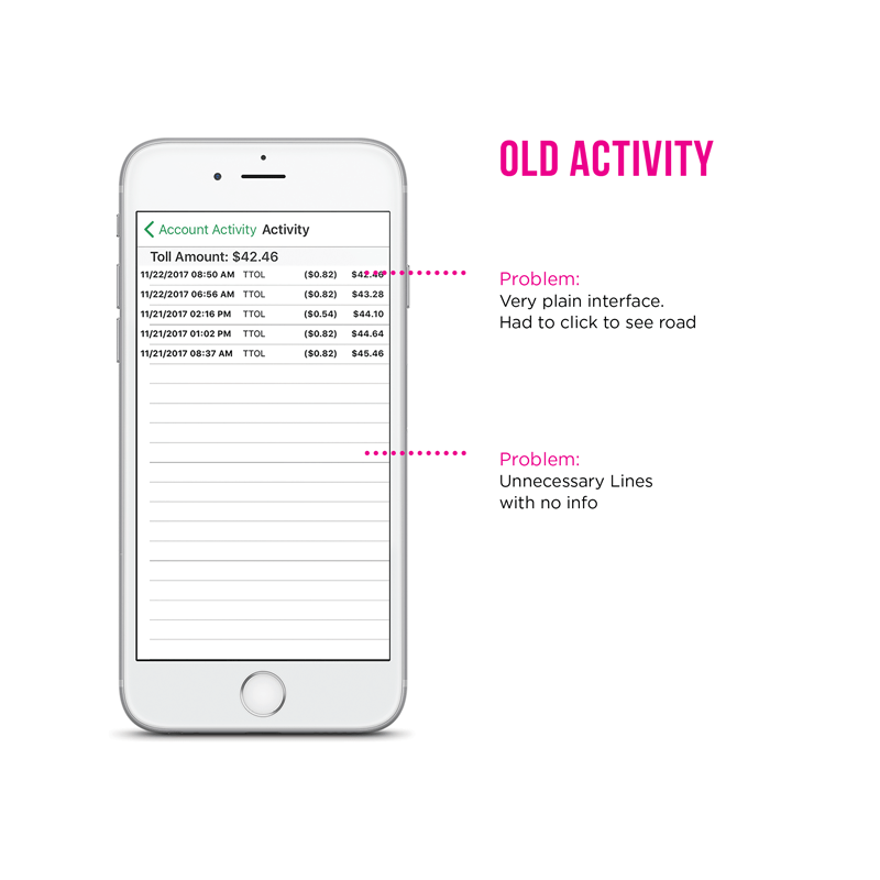
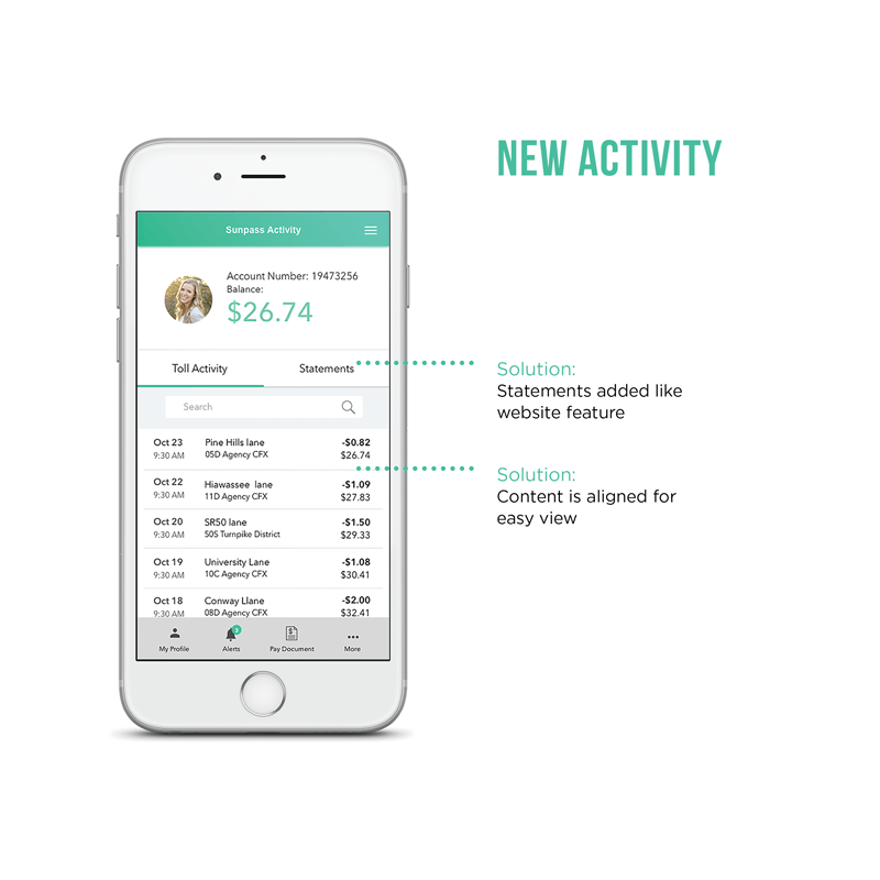

3/5 users can edit the license plate. The main complaint was having to click on the vehicle and then tapping the edit button to make changes.

5/5 can find the edit feature on the vehicles page.

2/5 can find the pay toll feature. The main complaint is that it’s only available on the sign in screen.

5/5 could easily find the pay toll feature as it was on the bottom global navigation.
I very much enjoyed the design process, from ideation to validation, for the Sunpass app. During one user testing, someone pointed out the lack of a home button on the bottom bar, which is a crucial element on the app.
In this project, I was working by myself without any industry experience. I learned how important it is to narrow down the target audience and focus on the problem I was capable of solving. My professor was the proxy stakeholder who came with a ambiguous project scope and I had to focus on being agile to complete this project and several others before the portfolio deadline.
Although it is easy to assume what is best for the product, I also learned the importance of not relying on my own assumptions and to constantly validate my own ideas with user feedback.