AIGA SPOT Showcase
Web Design
This is a self promotional project for a capstone exhibition for our 2017 Mentorship Program.
This is a self promotional project for a capstone exhibition for our 2017 Mentorship Program.

This is the capstone exhibition for our 2017 Mentorship Program. Over the past 6 months, design students from around the city have worked closely with local professionals to create a self promotional project.
This project was self initiated challenge to redesign the website to reflect their store branding. Redesign Mamak's online website to match the ambiance and brand of Mamak.
My Role:
Web Design, Development, Data Visualization
Duration:
Oct 2016 - April 2017
Tools:
Photoshop, Sketch, InDesign, InVision
My research encompassed using competitive analysis and finding out the motivations behind ecommerce apps, which hare to find deals, make purchases at any time, compare products and prices, and save time.

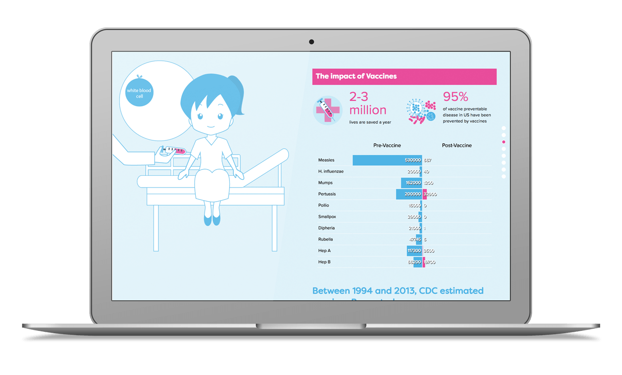
In recent years, diseases that were almost eradicated have resurged in the states. Outbreaks of measles were happening in Minnesota and Disneyland. As an advocate of vaccines, I wanted to see why it is happening and help inform people the significance of vaccines.

How to portray the message in a fun and educational way. Find data and statistics about measles and outbreaks and the signficance of the results.

With the help of my mentor and lots of research, I created an animated infographic that details the significant impact of vaccines and why it is important to be vaccinated.
This project showcases a website that has animated scrolling combining CSS animations and JavaScript to manipulate page elements upon scroll to immerse the user into a developing story.
The audience I am designing in mind for is for young people and parents.
What I had in mind was a project with a storytelling and infographic element to inform people about the history and point of vaccinations. The examples here had great motion and illustration to convey the story.
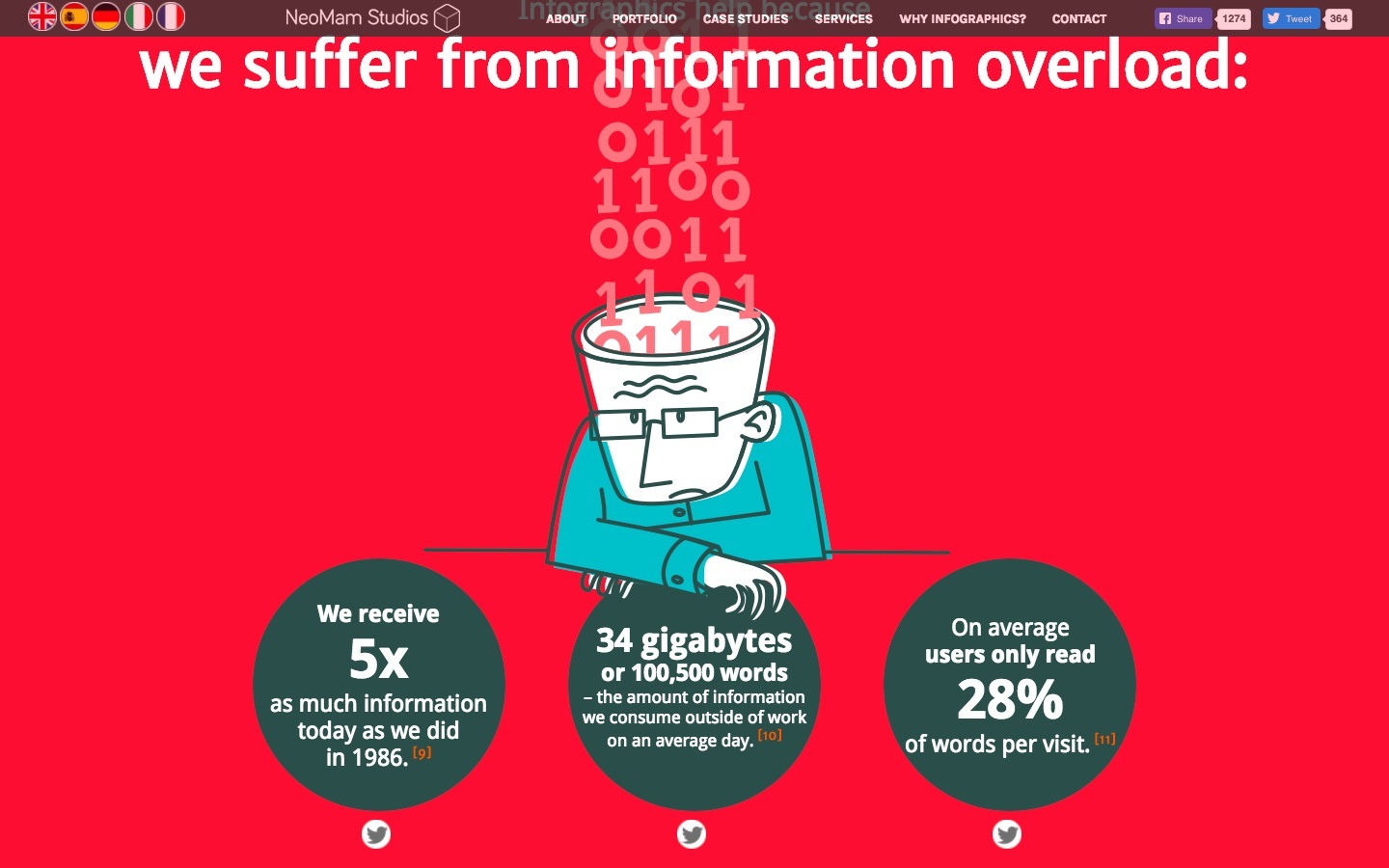
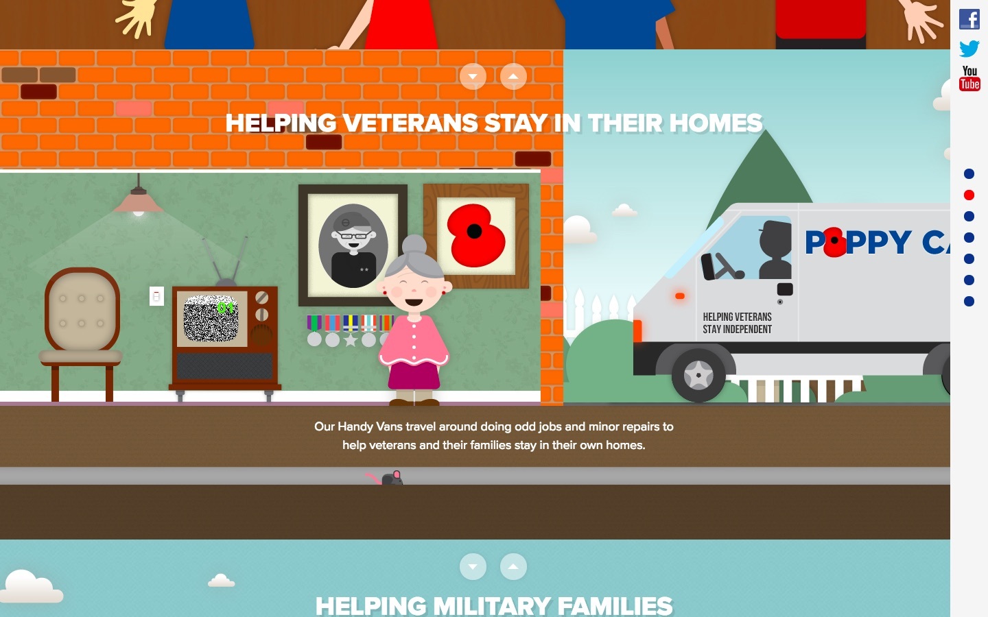
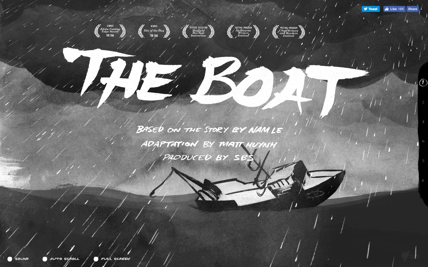
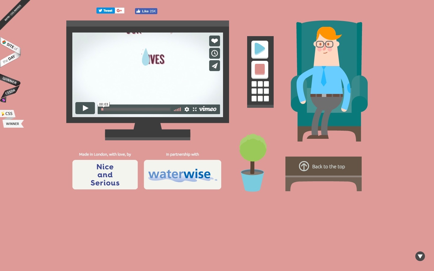
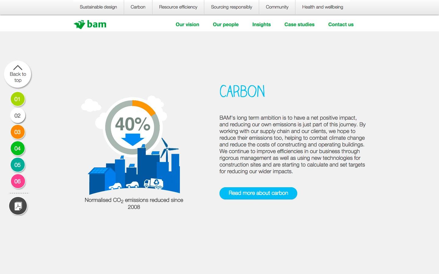
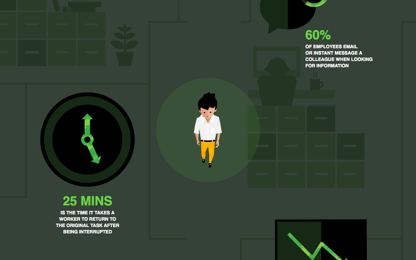
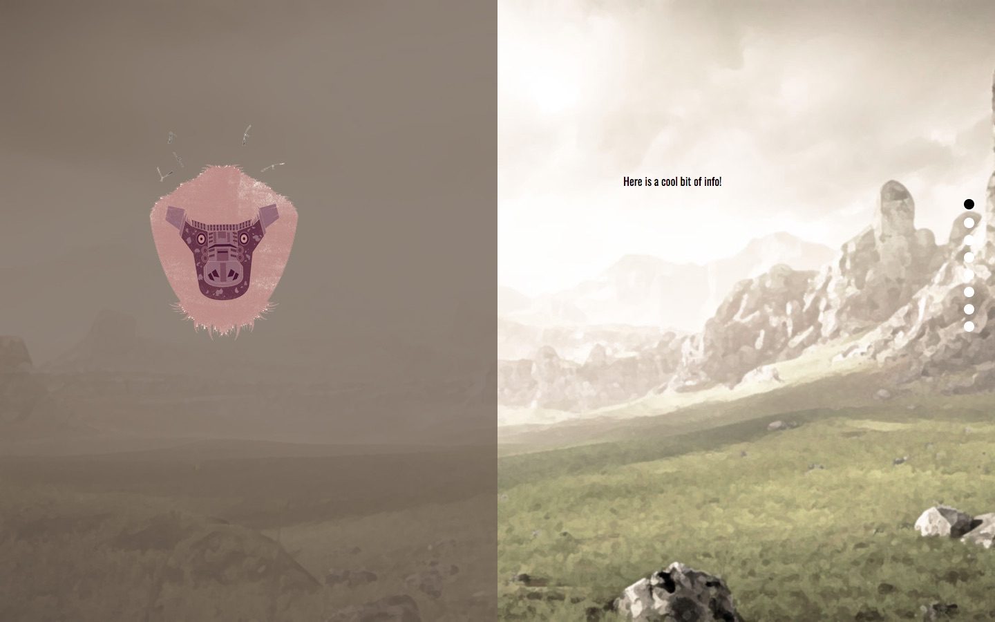
With the project concept in mind, I had to find out what information was relevant to the story and would help portray its message. Each section is followed by a conclusion to why vaccines are important.The left side would illustrate and animate to tell a story and the right side would relay facts and information like an infographic.
I got most of my content from the CDC and reputable government sites. Other information were from vaccine related infographics. With so many vaccine for different diseases, I focused my story on measles and its recent resurgence.
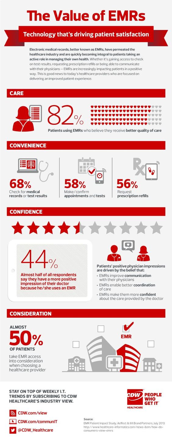
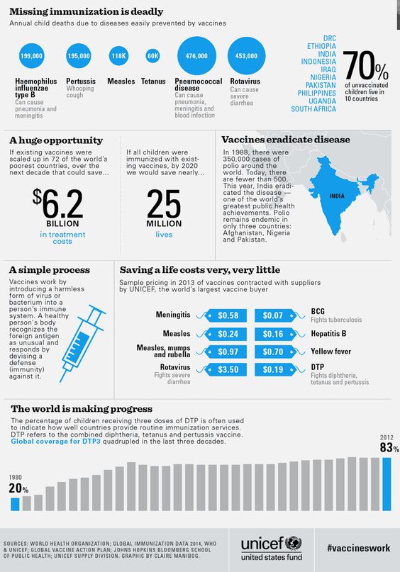
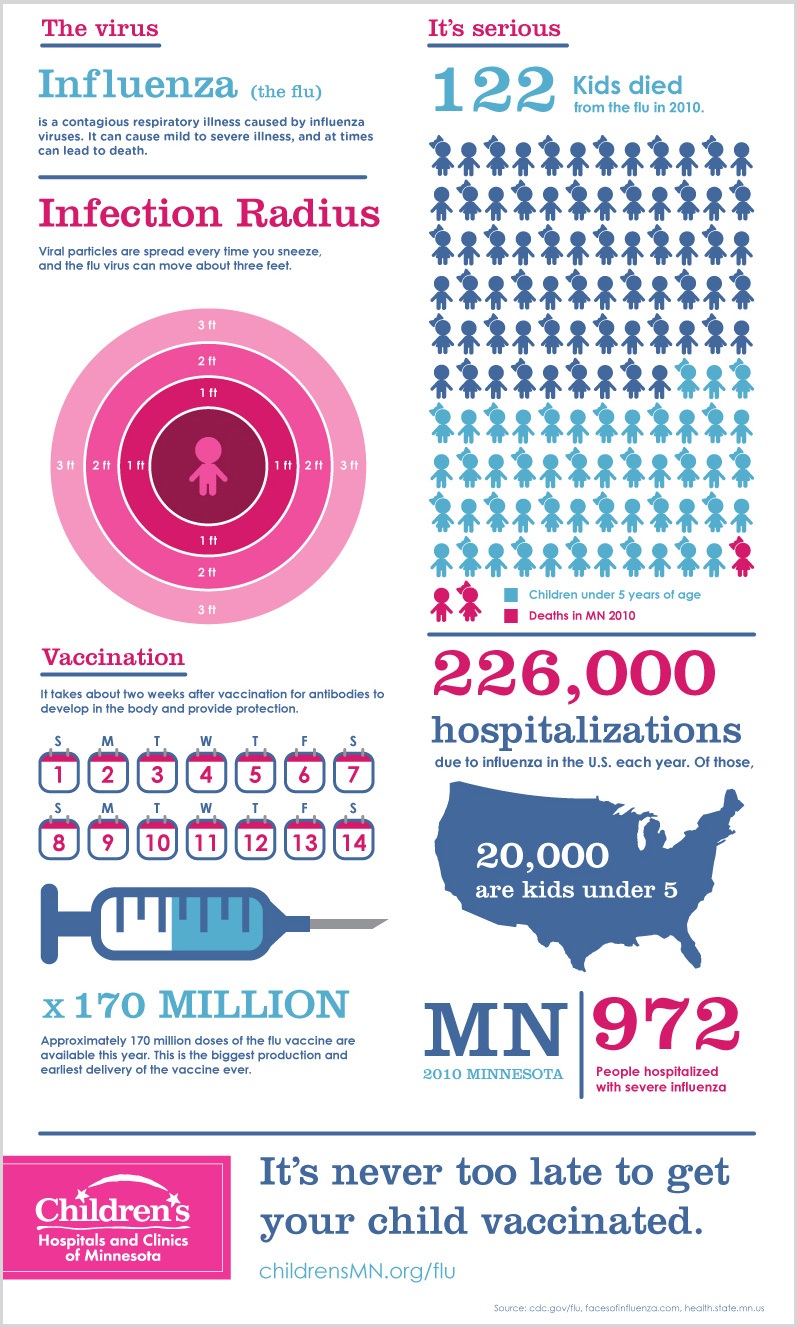
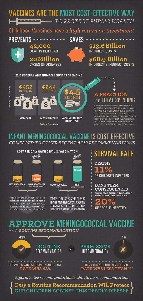
Contrasting colors appealed to me and blue and pink are very youthful colors that is easy to carry the message to the younger audience.

With text, I wanted a softer look. Ones that are round and legible that goes well with the design

Illustrations are quite difficult to me as I am note a versatile illustrator. I designed what was comfortable to me and that was with some anime and chibi inspiration.
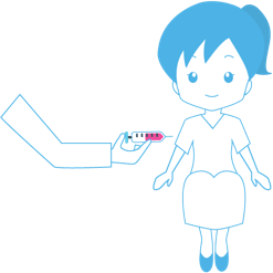
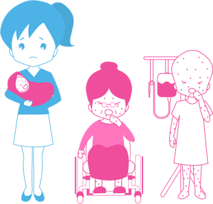
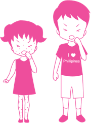
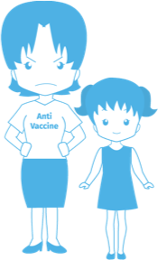
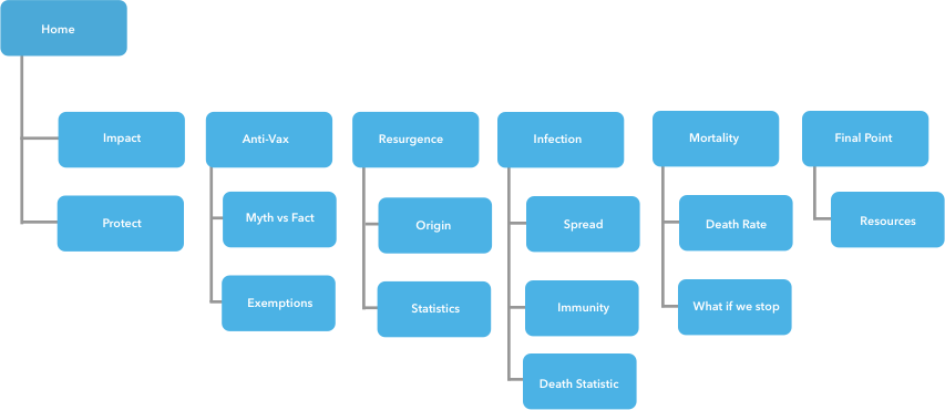
After I had a better understanding of the design and content elements, I made a very rough wireframe to display how the layout.

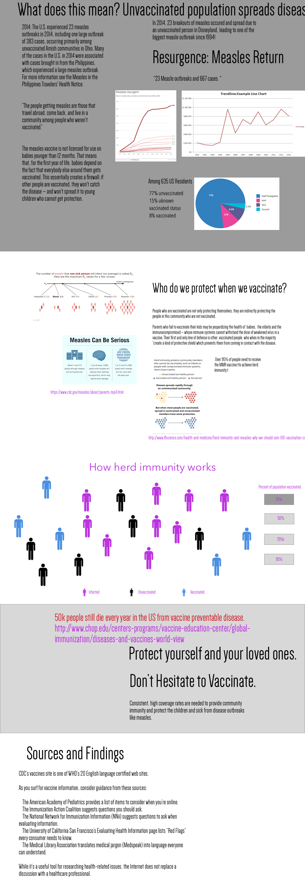
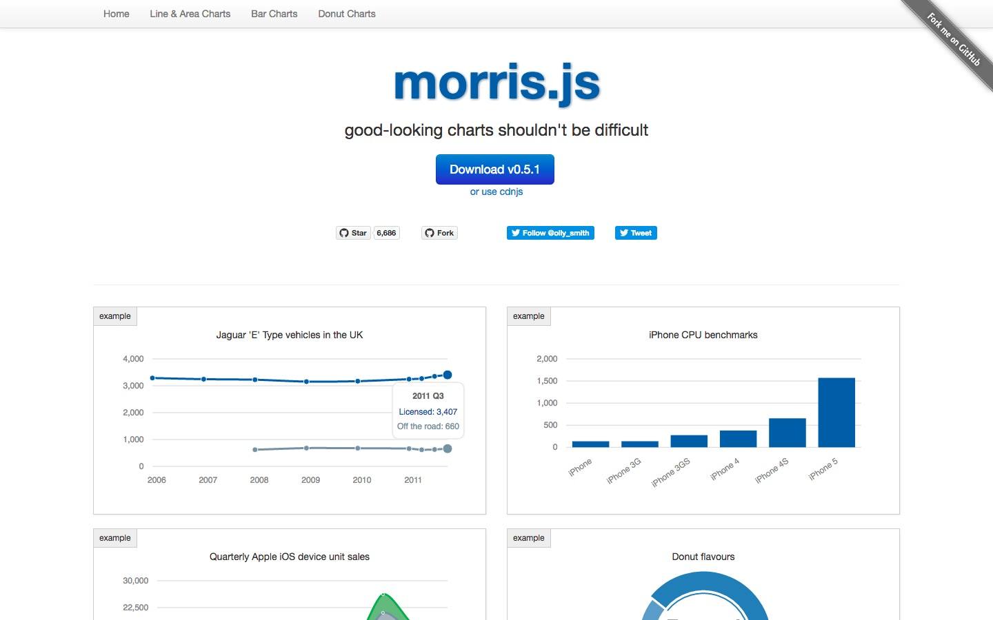
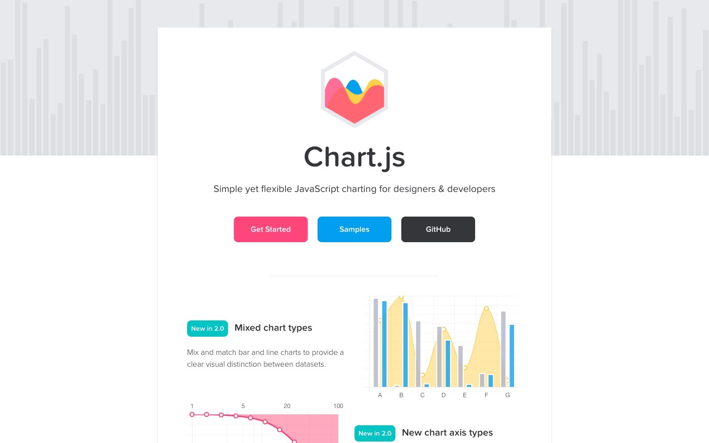
I started development with a template provided by my professor that was in tandem with a class project. I kept building and added motion elements and illustrations and used chart libraries for the data visualization components.
You can view the Showcase Project website here.

This project was one of the most difficult tasks I had to undertake. I had to juggle learning Javascript and apply what I learned to build something I've that I envisioned.
With the tools and help of my mentor and professor, I am proud of what I designed and developed for this project, and I hope that it brought better understanding to people who view it about the importance of vaccination to prevent diseases.